About project
Sl82025Client work
A crypto social app that stopped looking like a side project.
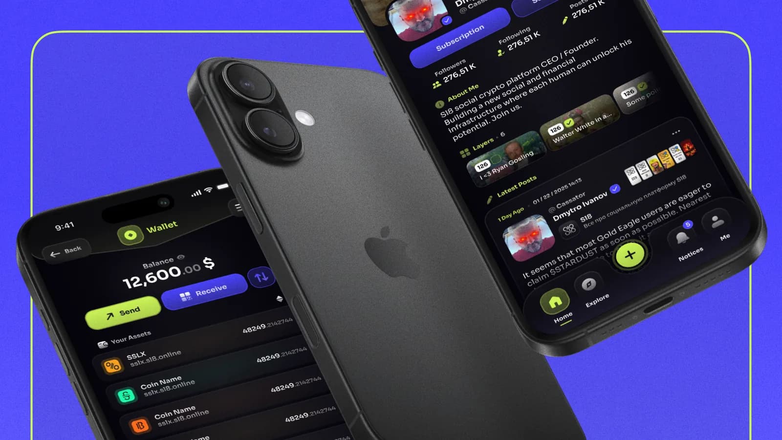
Sl8 is a Ukrainian social network with crypto built in: posts collect coins, and every account has a wallet. The mobile app worked, but on flat grey screens, and its team wanted a new look without having picked a direction. I set one: a near-black brand system in indigo and lime, plus an app icon, carried through four screens.
- Role
- Product & UI Designer · Branding
- Client
- Sl8 · social crypto app
- Platform
- Mobile
- Tools
- Figma
Challenges
Sl8 already worked: a feed where posts collect coins, profiles with Layers, and a wallet with tokens, staking and NFTs. It all sat on flat grey, with one purple filling every button. The redesign had to give Sl8 a direction of its own while every feature stayed where members already used it.
- Every existing feature stays: coins on posts, Layers, invites, the wallet
- No brand direction yet: no colours or style chosen
- Mobile, at the proportions of an iPhone 15 Pro Max
- Light and dark themes exist, and the dark one comes first
- The member
- reads posts, tips them in coins and checks a balance, all in one app.
- The wallet
- holds real tokens, so it has to look like a place worth trusting with money.
Solutions
- 01
I changed the look and kept the map
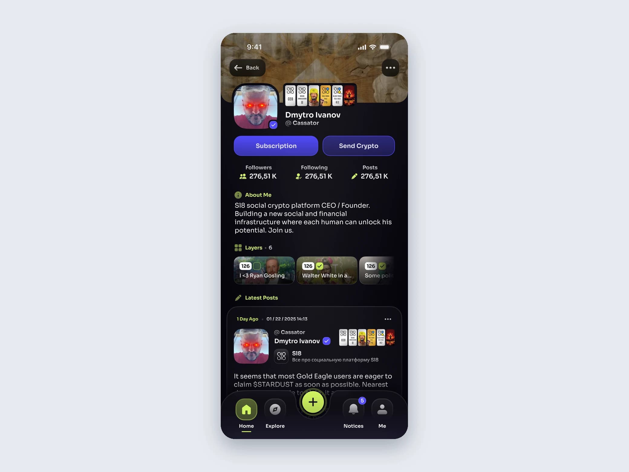
Members already knew where the coins, Layers and the wallet were, so I kept the structure close to the existing app and reworked a layout only where it clearly got in the way.
Trade-offSome of the app's older UX problems stay for a later pass, because I did not reopen the structure screen by screen.
- 02
I kept the purple and gave it a partner
Purple was the one colour Sl8 already owned, so I kept it, moved it to a brighter indigo and gave it the brand's job. Lime joined for creating, sending and where you are, and near-black replaced flat grey, so avatars, cards and coin balances carry the colour.
Trade-offTwo loud colours need strict jobs, and a near-black base leaves little room for depth: cards need their own borders and tints to stand off it.
- 03
Layers went from a grid to one row
Layers used to be a grid of covers in mixed sizes. On the new profile they are one row of cards, each with a cover, a name and a count, and the rest scroll sideways.
Trade-offFewer Layers are visible at once: a member in many of them sees only the first few without scrolling.
Starting point
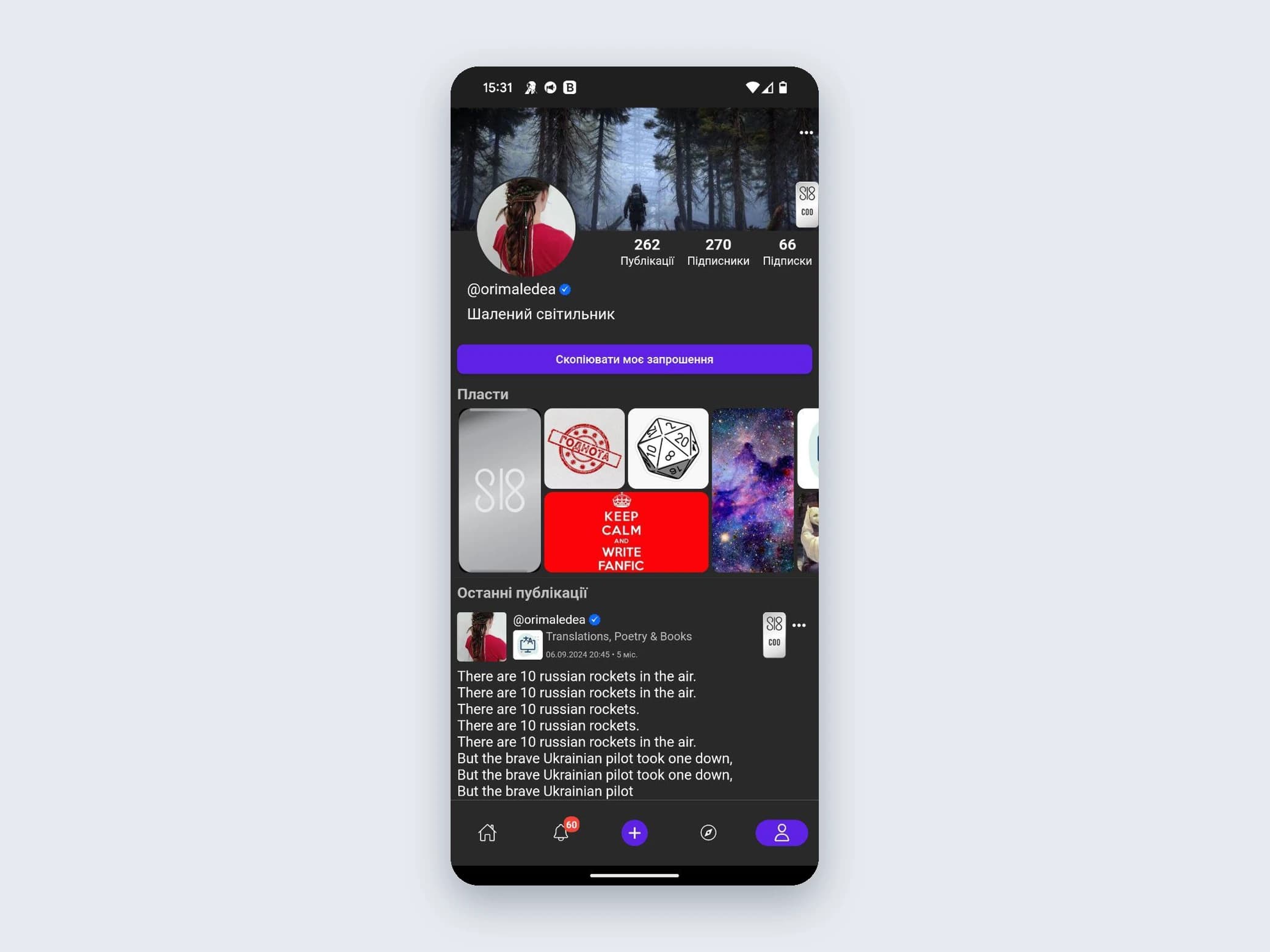
Every feature was there, on flat grey
One purple marked every filled button and the active tab. The redesign works with the same parts and changes how they look, starting with the profile.
Brand
Indigo for the brand, lime for the action
Indigo carries the brand, and lime marks creating, sending and where you are, both on near-black with lavender white text. The type is Sora in four sizes and four weights, and the app icon puts the Sl8 mark on an indigo tile with a lavender inner edge.
Brand
- Main#524BFCThe brand: filled buttons, links, badges
- Accent#D1F661Create, Send and the tab you are on
- Text#E3E1FFText on the dark base
- BG#05030CThe near-black base
- Type
- Sora12, 14, 15 and 17 px
- Weights
- Semibold, 550, 650 and Bold
Welcome
Two welcome screens: lime leads, or indigo leads
The welcome screen shows the brand before anything else: the icon, the sl8.online wordmark and the line Where crypto meets social, over two actions. I drew it twice.
Feed
Each post ordered: who, what, how it did
A post keeps everything it had in the old app. The new card orders it from who to what to how it did: the author and their collectible cards, the text, a row of totals, then the coin buttons, translate and comments.
Profile
Seven layouts to one profile
The profile took the most passes, from a grey wireframe to the final screen. Counters went from pills to plain numbers, and the Subscription and Send Crypto buttons moved from under About to under the name.
Profile versions
Wallet
The balance first, then the assets
The old wallet opened on tabs for staking, currencies and NFTs, with three equal purple buttons above the list. The new one opens on the total balance. Send takes the lime, Receive the indigo, and exchange becomes a smaller button beside them.
Results
Sl8 got a direction it did not have: one near-black system with fixed jobs for indigo and lime, a type scale in Sora and an app icon.
Reflection
- When a team has not chosen a direction, keeping the one colour members already know gives a new look something familiar to stand on.
- Changing the look while keeping the map shows where a product can go without asking its members to learn it again.