About project
Seasons2025Shipped
Find a show by how you want to feel, not by genre.
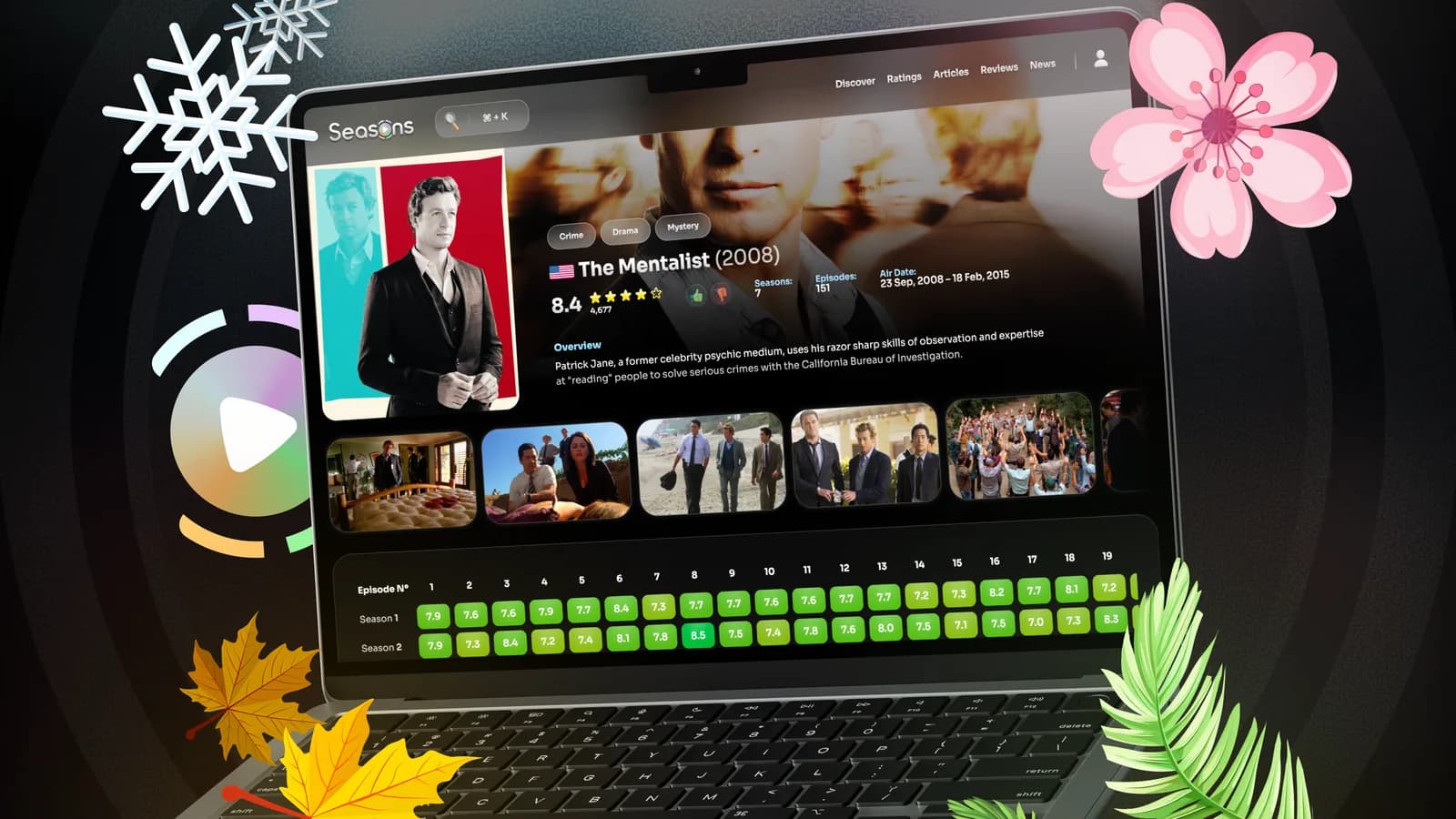
Seasons is a tracker for TV series, not a place to watch them: a catalogue, a watchlist and ratings down to the single episode. I designed the whole product, from the concept to a working web app, around one hook: you pick a mood, not a genre. The live build runs on that structure.
- Role
- Product & UI Designer
- Client
- Seasons · TV-series tracker
- Platform
- Web · B2C
- Tools
- Figma
Challenges
Every catalogue asks for a genre before it shows anything, and almost nobody decides that way: you know the mood you want long before you would say the word thriller. Seasons had to open with that mood and still run on the genre lists a catalogue needs underneath, without turning into one more grid of posters.
- The catalogue runs on genres: every mood has to fold a real genre list inside it
- Wall to wall posters and key art: the interface has to stay quieter than the artwork
- A show can run fifteen seasons, and a score per episode cannot take over the page
- A tracker, not a player: nothing here plays, so the payoff is in choosing and keeping
Solutions
- 01
Four moods on top, real genres underneath
Instead of a genre dropdown, four seasonal vibes sit on top. Each quietly maps to real genres, so the database logic still works underneath.
Trade-offEdge titles fit two moods, so someone has to make the call and the mapping needs an owner.
- 02
A near monochrome shell, one seasonal accent
A calm dark shell lets the seasonal accent carry all the personality without fighting the artwork.
Trade-offLittle brand colour to lean on; the single accent has to do a lot of work.
- 03
Every state and hotkey prototyped before the build
I specced the whole SPA in Figma, shortcuts and motion included, so the build could match the design without guesswork.
Trade-offHeavy up-front spec time for a small feature surface.
Identity
A logo whose play button follows your vibe
The mark carries the idea before any screen does. The shell around it stays near monochrome on purpose, so exactly one thing on the page carries colour, and it follows the season.
- The o in Seasons is a play button, and it takes the colour of the vibe you picked
- Snowflakes, blossoms, leaves and maple leaves sit around the mark, one set per season
Vibe
The product opens with a mood, not a genre
The product asks one question: what is your vibe today. Four seasons, four moods, and each folds a real list of seven genres inside it, so the catalogue keeps working while the person browsing never has to name a genre. Choosing one re-themes the home and narrows what it shows.
Four vibes, four moods
Discover
Decide in the row, search over the same page
Discover opens on one featured series big enough to read, with rows to scan below it. A poster under the cursor lifts out of its row and brings a card with the title, year, rating and genres, so the decision is made without leaving the row.
- Search is a panel over Discover on Ctrl + K, not another screen
- Applied genres stay as removable chips, with the result count above the rows
Series
A score per episode, not one per show
The series page is where the tracking lives. Its grid gives every episode of every season its own score, green down to red, so the shape of a show is visible before a word of it is read.
- The grid opens on four seasons and says how many are hidden: Reveal all 15 seasons
- An episode without a score keeps its cell and says so, instead of dropping out of the grid
Before
The earlier cut had the data, not the reason
The cut that came before, under the name Smash.TV, already had the content model: the show, the rating, the seasons, the air dates. What it did not have was a reason to pick one series over another, and that gap is what the seasonal vibe fills.
Results
The live build runs on this structure: mood-first browsing on Discover, search across the whole catalogue, and series pages rated down to the single episode.
Reflection
- Sorting by mood instead of genre turned a database problem into a friendly one; the genres still exist, they just hide behind a feeling.
- Prototyping every state and shortcut in Figma is what let the build match the design exactly, with no guesswork left for engineering.
- A near monochrome base kept the system calm, but it leaves little brand colour to lean on: the seasonal accent has to do a lot of work.