About project
CryptoBot2023Concept
A crypto wallet that lives inside Telegram.
CryptoBot keeps its users' crypto inside Telegram, and the brief was to rebuild its Wallet section as a Telegram Mini App. I designed it solo for iOS: balances in dollars, deposit by address or QR code, and withdraw with its error states. The result is a clickable 26-page Figma prototype where deposit and withdraw share one step pattern.
- Role
- Product & UI Designer, solo
- Client
- Crypto wallet · Telegram Mini App
- Platform
- Mobile
- Tools
- Figma
Challenges
The Mini App had to do everything the Wallet section does in the part of the screen Telegram leaves free. In crypto, a coin sent on the wrong network or address does not come back. Every step that moves money had to make the choice plain and the mistake hard to make.
- 390 by 659 points: an iPhone screen minus Telegram's header and bottom menu
- Nine coins, some on several networks: Tether alone on TRC20, ERC20 and BEP20
- Dollar values next to balances, minimums, fees and totals
- iOS first, Android and desktop Telegram later
- The holder
- wants each balance, and the total, in dollars at a glance.
- The sender
- picks a coin, a network and an address, and one wrong pick can lose the coins for good.
Solutions
- 01
I drew iOS in full instead of three platforms
Telegram runs on iOS, Android and desktop, and the first plan was to cover all three. I drew iOS in full instead, with pressed states that also answer a hover for a later desktop version.
Trade-offAndroid and desktop were never drawn, and on desktop a hover would look the same as a press.
- 02
Deposit and withdraw share one step pattern
Both flows share one frame: a title that says what to do, a step counter, a coin grid and a network list. The second flow cost less to design and asks nothing new of its user.
Trade-offA quick transfer still takes four screens and a confirmation, where a single form could hold every choice at once.
- 03
Every check comes before the money moves
Deposit warns to send only the chosen coin on the chosen network. Withdraw checks the address before asking for the amount, stops when the balance is under the minimum, and repeats the network, address, fee and total before anything is sent.
Trade-offEach check is one more message or screen before a transfer goes out, and the confirmation repeats what was just entered.
Wallet
Every coin in dollars, the latest operations below
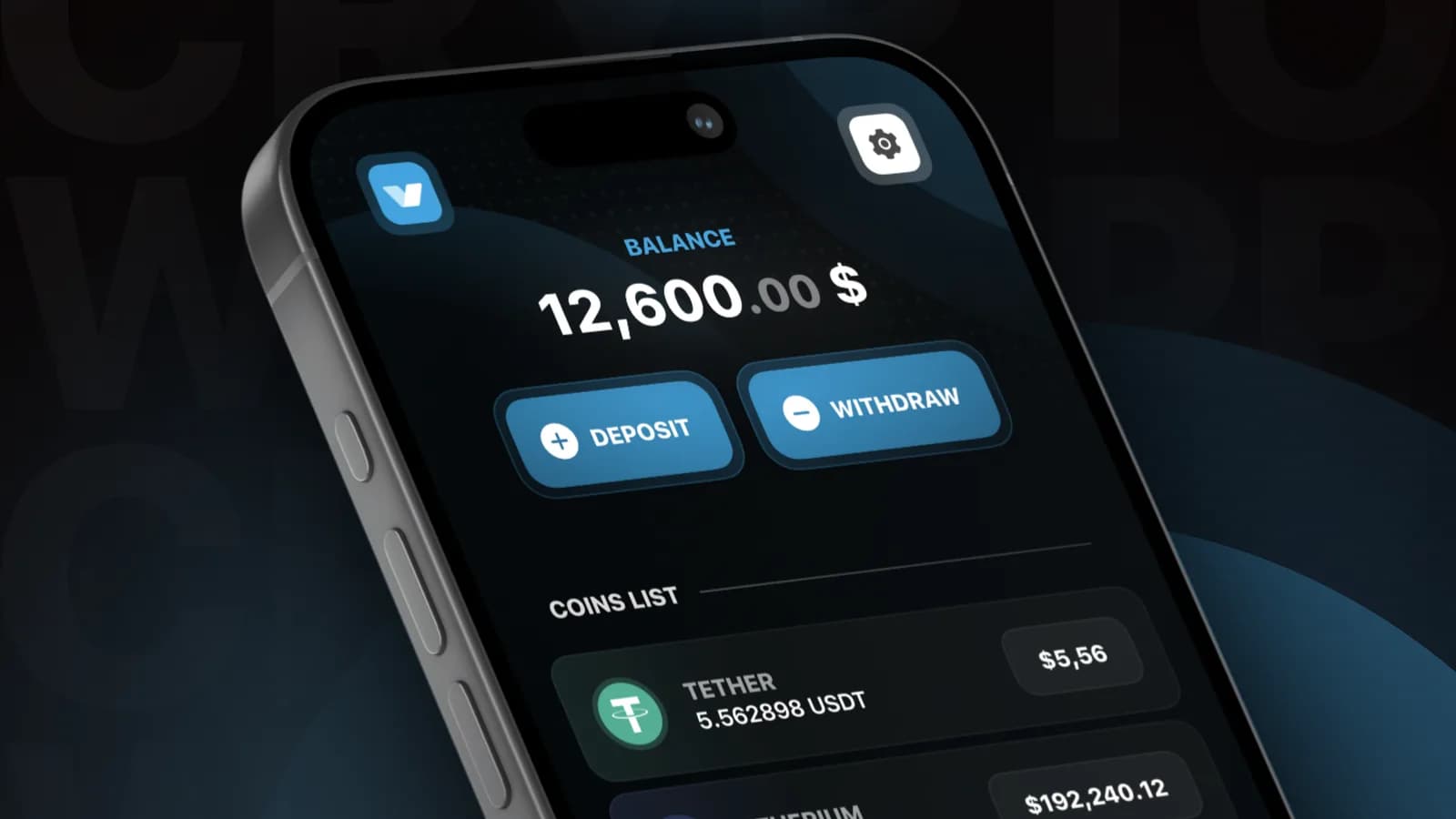
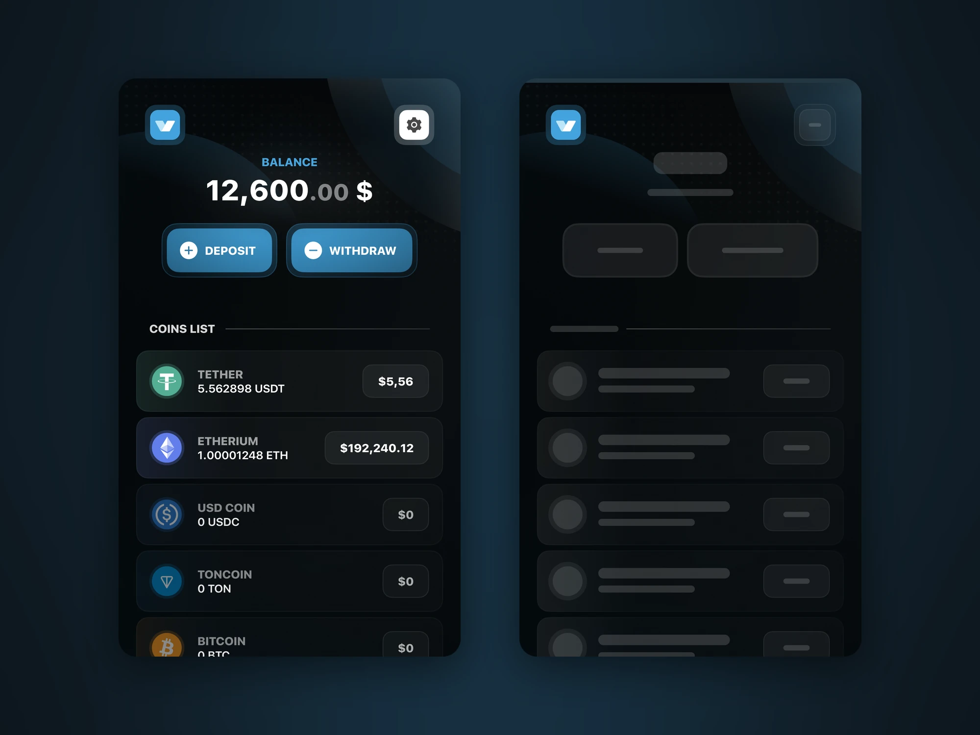
The wallet opens on the balance in dollars, with Deposit and Withdraw right under it. Nine coins follow, each with its amount and dollar value, and a coin at zero dims its icon to half.
Deposit
Three counted steps: coin, network, address
Deposit takes three steps, and the header counts them. A picked tile or row lights up in its own colour, and Next step stays dim until something is picked.
Deposit, step by step
Withdraw
The same steps, counted to four
The counter goes to four, because the address to send to and the amount follow the network. A confirmation, an offer to save the address and a receipt close the flow.
Withdraw, step by step
Errors
Three error states, each reachable in the prototype
Picking Tron at step two leads to Not enough coins, with a button back to the networks list. At step three, an empty address field and an address that fails its check each turn red with a message.
Kit
All 26 pages are variants of one component
The pages are built from a kit of 49 component sets, and the prototype runs on it: moving between pages is a variant swap with Smart Animate, the same as a button being pressed.
Dark theme
- Black#000000The base, under blurred blue glows
- Blue#44A3DDActions, the balance label and the total
- Green#44DD5CA transaction that went through
- Red#DD4444Errors and Not enough coins
Light theme
- Pale#F1F0F6The light base
- Blue#44A3DDThe same blue for actions
Coins
- Tether#53AE94A picked tile and a coin with a balance take its colour
- Ethereum#627EEA
- USD Coin#2775CA
- Toncoin#0088CC
- Bitcoin#F7931A
- Binance Coin#F0B90B
- Tron#FF0103
- Litecoin#345D9D
- Type
- SF Pro DisplayBold for names, labels and buttons, Medium for amounts and network lists
Themes
Dark drawn in full, light only started
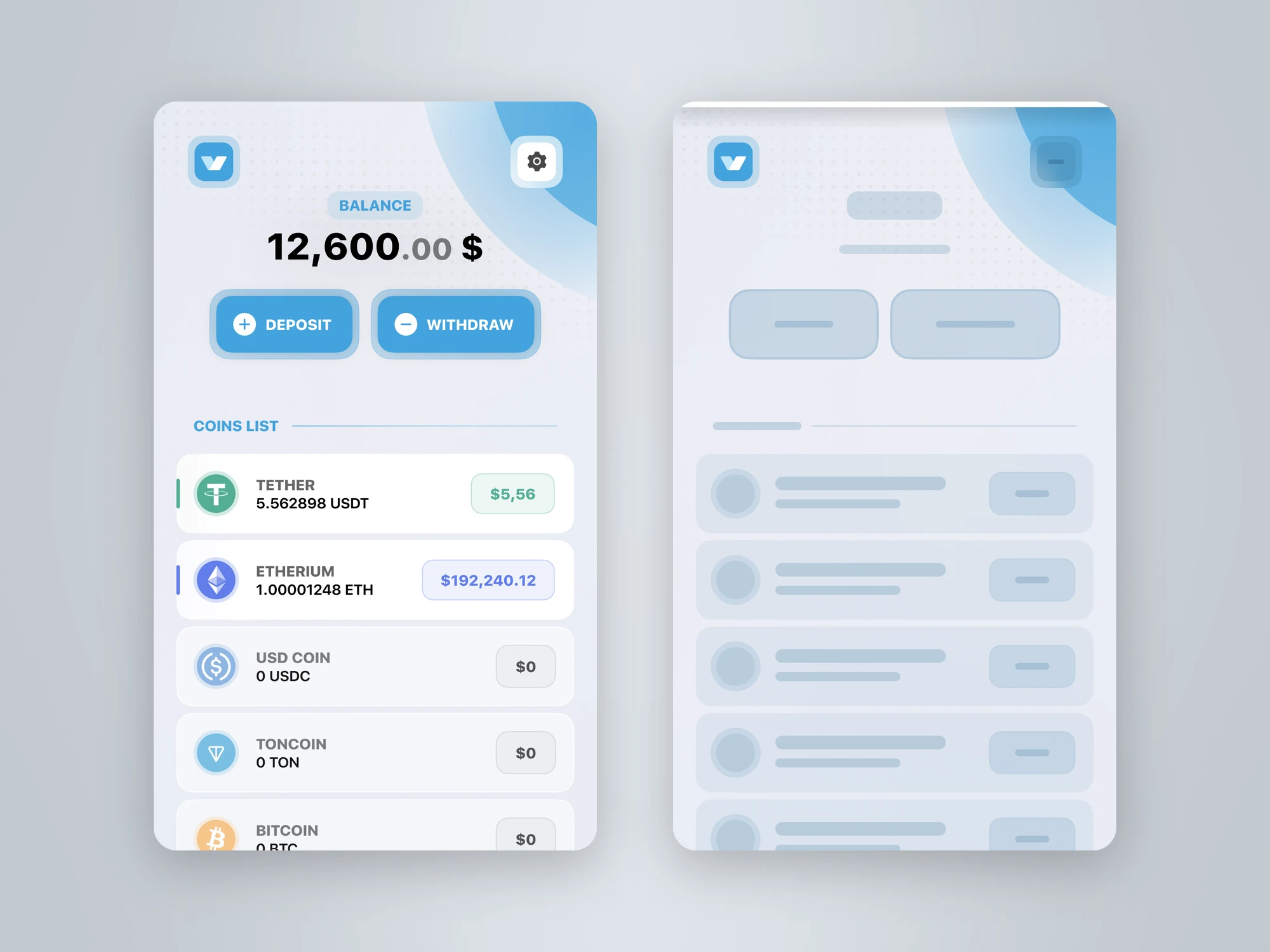
I drew the whole flow in the dark theme, then built the light one from it on a pale base. Light covers the wallet, its loading state and the first deposit step, and every other page exists only in dark.
- Both themes have a loading wallet: grey placeholders under a thin blue bar
- The prototype starts from four points: each theme, loaded and loading
Results
A clickable iOS prototype: from the balance into both money flows and back, with the failures drawn, dark throughout and a light theme started.
Reflection
- In a Mini App the frame belongs to Telegram: designing inside 390 by 659 points shaped the wallet more than any choice of style.
- A light theme built from a finished dark one starts fast and finishes slow. Next time I would carry both page by page, with colours in shared styles.