About project
HELIX2022-2023Shipped
A whole roleplay city, from the HUD to the phone in your pocket.
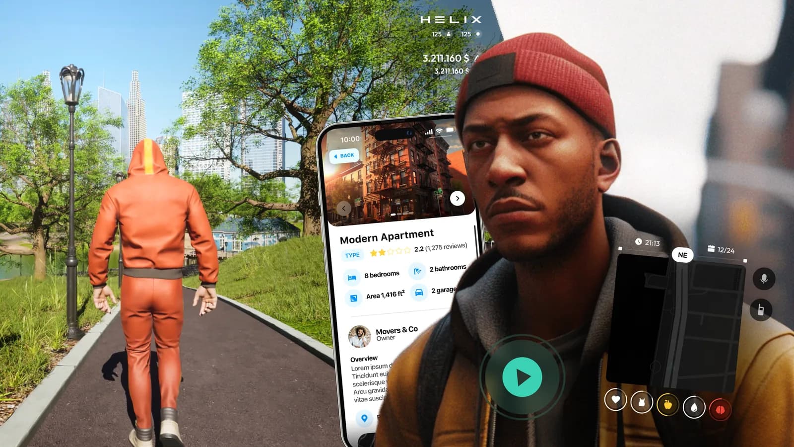
Helix is an open-world PC sandbox on Unreal Engine 5 where creators run their own game modes. I led the interface of its flagship roleplay city, Parallel City Online (PCO), in a team of three designers, from the design system to release, then designed the interface of Dark RP, Helix's second roleplay mode. PCO's components were reused across the platform.
- Role
- Lead UX/UI Designer (team of 3)
- Client
- Hypersonic Laboratories Inc. · Helix
- Platform
- Game · PC
- Tools
- Figma, Photoshop, LottieFiles
Challenges
In PCO players choose a role, from police officer to bandit, and live a second life: they work, drive, shop, gamble, rob and arrest each other. Every activity is a system with its own screens. The interface had to turn dozens of systems into one language that reads at a glance and that the team could keep extending.
- Dozens of systems in one mode, from the HUD and cars to police tools, mini-games and a phone
- Read over a live 3D city, by day and by night
- Played with keyboard and mouse: every action needs a key and a hover state
- A team of three designers, with every layout prepared for development
- The player
- goes from driving to a shop or a heist in minutes, and should never relearn where the money, the map or the way back are.
- Police and admins
- keep order on a live server and need tools that are quick in the middle of a situation.
- The developers
- build the city system by system, and need every screen with its states, not a single picture.
Solutions
- 01
One frame under every shop
I put the showroom, the bar, the cinema, the gun store and the mechanic on one frame rather than each to its own logic: the wallet at the top right, the goods in the middle, every price marked with the gold LIX sign, Esc at the bottom right.
Trade-offEach place's character has to come from its dress, which means artwork for every venue, and a dress can bend the rules: the bar's Buy drinks button glows neon, not gold.
- 02
The world first, the menu second
A place opens from the scene: at the bar a prompt offers E for Buy drinks, the menu opens over the blurred room, and a purchase ends back in the world with a small notification, so a player is never parked in a menu.
Trade-offEvery purchase takes two steps instead of one, and the prompt only works if the level places it where people stop.
- 03
The phone carries what can wait
I put messages, the bank, stocks, insurance and events into phone apps, so the HUD keeps to what matters in the moment: health and needs, the map, money and the hotkeys. Even a call opens the phone at the edge, not over the street.
Trade-offAnything on the phone is a few clicks further away, so the phone borrows patterns players already know from their own phones.
- 04
Keys on the actions that matter
PCO is played on a keyboard, so most main actions show their key: Enter on gold buttons such as Buy for LIX, Space for a test drive or a spin, Q and E to page through cars, parking spots and films, Esc to leave every screen.
Trade-offKeycaps add clutter, every hint has to stay true when the controls change, and they did not reach every button: the cinema's Buy a ticket still has none.
System
Three accents carry most of the meaning
PCO stands on one kit: on most screens, dark glass panels over the scene, Outfit for the type and three accents. Every control is drawn in its states, with the hover timing written down for the developers.
Accents
- Teal#00D9B1Selected, in progress, yours
- Gold#FFC93EMoney and the main action
- Coral#FF5347Danger, loss and what is closed
- Interface
- Outfit
- Dark RP
- BarlowThe HUD of the second roleplay mode
- Phone apps
- SF Pro TextKeeps the in-game phone in iOS proportions
HUD
The HUD keeps to the corners
The street has to stay readable, so chat, the map, voice, money and hotkeys stay at the edges, drawn in two layouts. The centre is borrowed only when play needs a decision.
Character
Locked tiles say what is missing
The main menu gathers a whole character, from quests to the family and a business, in twelve tiles. A locked tile is not hidden: it says what is missing, so a new player sees what the city has to offer.
Vehicles
The showroom puts tank and trunk above speed
A car follows a player through the whole economy, so it gets a full journey. The showroom sells on what matters in a roleplay city: tank, consumption and trunk space above the speed.
At the mechanic
Venues
Four casino games share one frame
Businesses are places first, each in its own dress. The casino runs four games on one frame, so a player who has learned roulette already knows where the bet, the balance and the timer are at blackjack.
The casino: four games on one frame
Police
Police and admin screens work as tools
A police profile gathers warrants, fines, criminal history and vehicles with their plates. A fine is a paper form with a separate civilian version. A ban cannot be confirmed until the reason and the term are filled in.
Jobs
Work and heists are played, not waited out
An office shift is played as match-three, with the same board re-dressed for other jobs; a car door is picked in four stages. Every mini-game hides the HUD and keeps its controls and Esc in the corner.
Phone
The phone stays close to iOS on purpose
The phone opens on P over the game and reads at a glance. Each of the thirteen apps was designed as a prototype next to its own UI kit.
Dark RP
A second mode gets its own HUD, in Barlow
Dark RP brings the classic roleplay format of Garry's Mod servers to Helix: jobs, an elected mayor, a police agenda. I started from a research board of existing server interfaces and gave the mode its own HUD in Barlow.
Results
Parallel City Online went from first concept to release on this system, and the same components were reused across the Helix platform.
Reflection
- Separating identity from function let one language serve roles with opposite goals.
- Prototyping every state in Figma caught flows that static screens hide.
- The narrow palette kept the world legible but made a legendary drop or a critical alert hard to push. Next time I'd budget one or two spotlight tokens.
Links
- ChattrThe city's social network, an app on the in-game phone
- JobSeekJobs and hiring, an app on the in-game phone
- Property PulseBuying and renting property, an app on the in-game phone