Helix Game
Web3 meta-universe created with unreal engine 5, a game in which the player has access to a variety of modes for pastime, built on Etherium coinage
Services
Product Design, Strategy, Branding
Services
Product Design, Strategy, Branding
Services
Product Design, Strategy, Branding
Tools
Figma, Adobe Creative Suite
Tools
Figma, Adobe Creative Suite
Tools
Figma, Adobe Creative Suite
Value
Crypto, Metaverse, Web3, Game, Gambling
Value
Crypto, Metaverse, Web3, Game, Gambling
Value
Crypto, Metaverse, Web3, Game, Gambling
Timeline
12 month
Timeline
12 month
Timeline
12 month

Related Projects on Behance
Related Projects on Behance
Related Projects on Behance
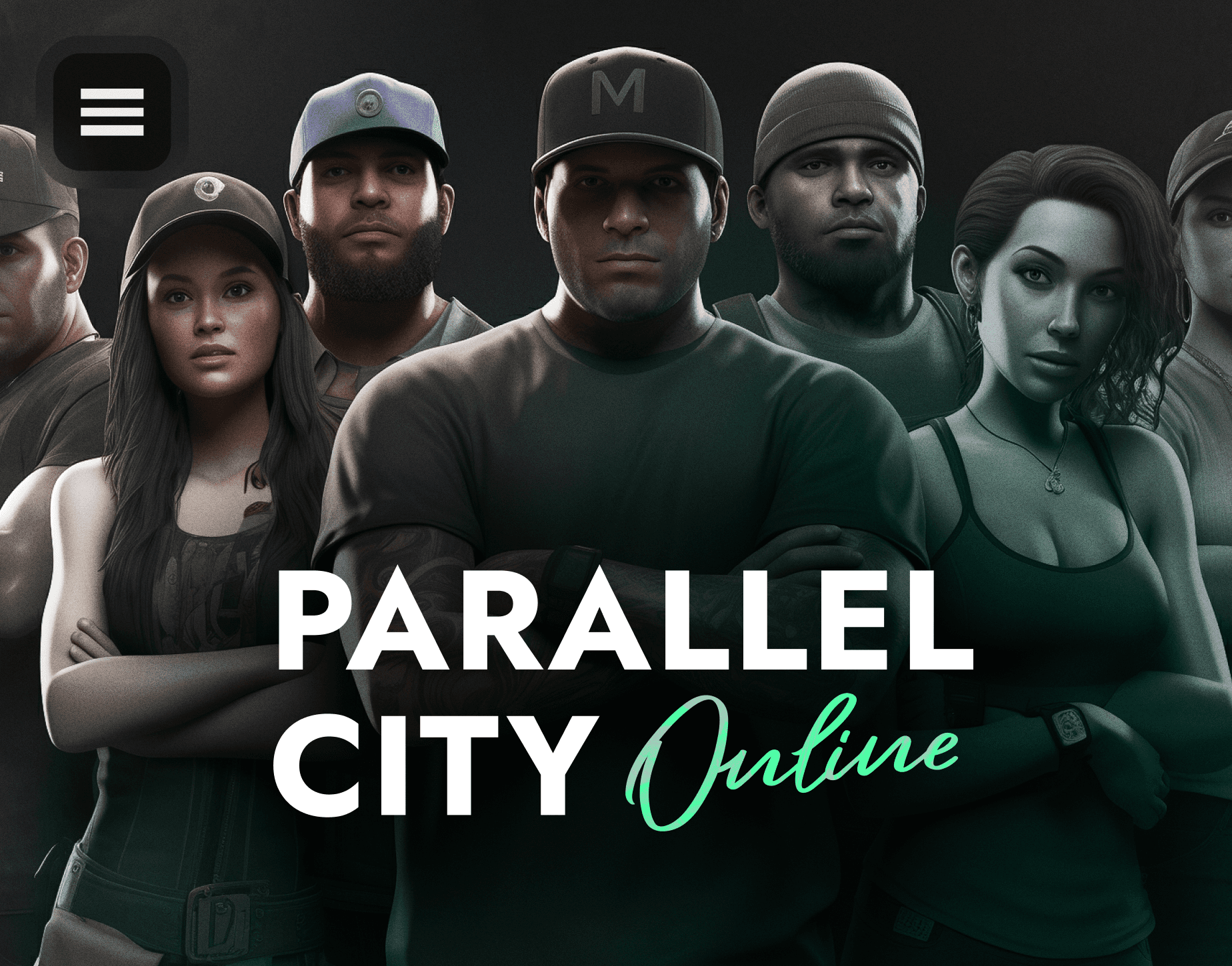


Project Overview
HELIX is a Web3 metaverse game featuring multiple immersive game modes. I served as the Lead UI Designer for one of its flagship experiences — Parallel City Online (PCO), a roleplay mode inspired by GTA 5 RP mechanics.
With years of experience designing for GTA RP communities, I was selected to lead a team of 3–4 designers, collaborating directly with developers, managers, and stakeholders to build a realistic, functional, and immersive user interface for this living digital world.
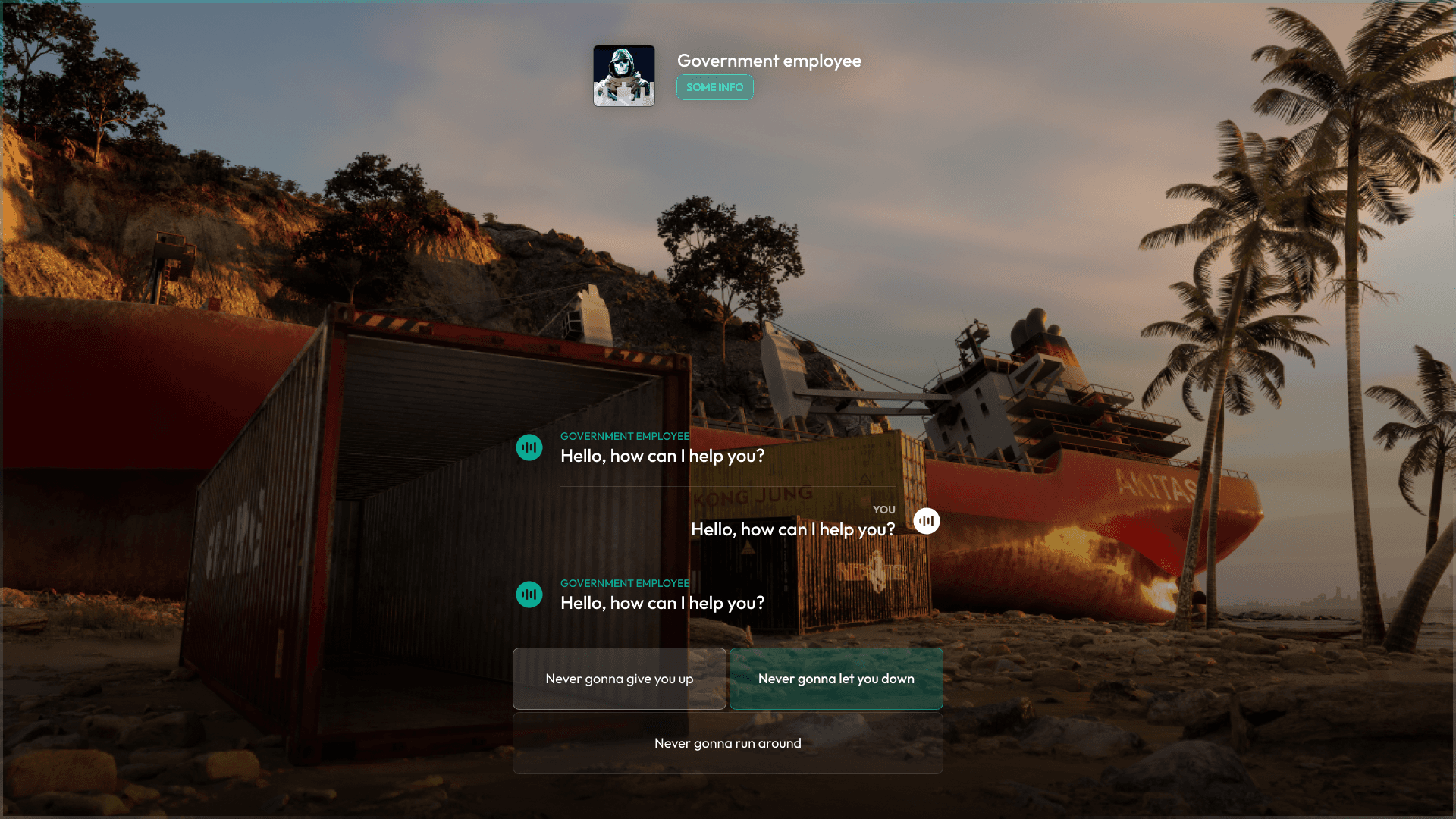


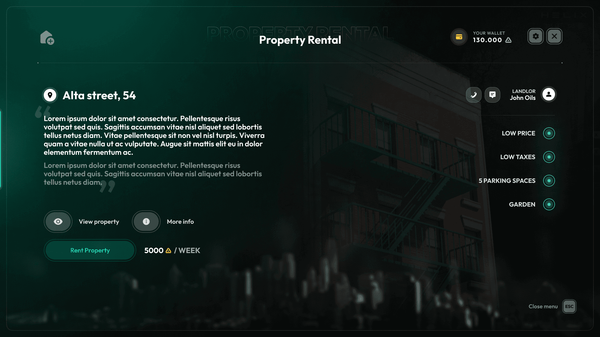
Context & Problem
Parallel City Online (PCO) is a HELIX game mode where players live out immersive virtual lives — often beyond real-world limits. The UI needed to support that freedom while staying grounded in realism.
We aimed for a modern, immersive design that reflected real systems and brands, but adapted to the game’s universe. Every detail — from hover effects to in-game apps — had to feel intuitive and unified.
Instead of tired UI patterns, we built something fresh yet familiar, focusing on consistency across dozens of systems without losing the core metaverse vibe.
Research & Approach
I drew from extensive experience in GTA 5 RP — both my own and others’ work — to understand what felt outdated and what players still enjoyed.
I also used real-world references, especially official documents and systems from New York City, like licenses, police databases, and banking interfaces.
Key principles:
– Realism with a gamified vibe
– Unified visual language across all systems
– Clean, functional layouts
– Subtle motion for feedback and flow
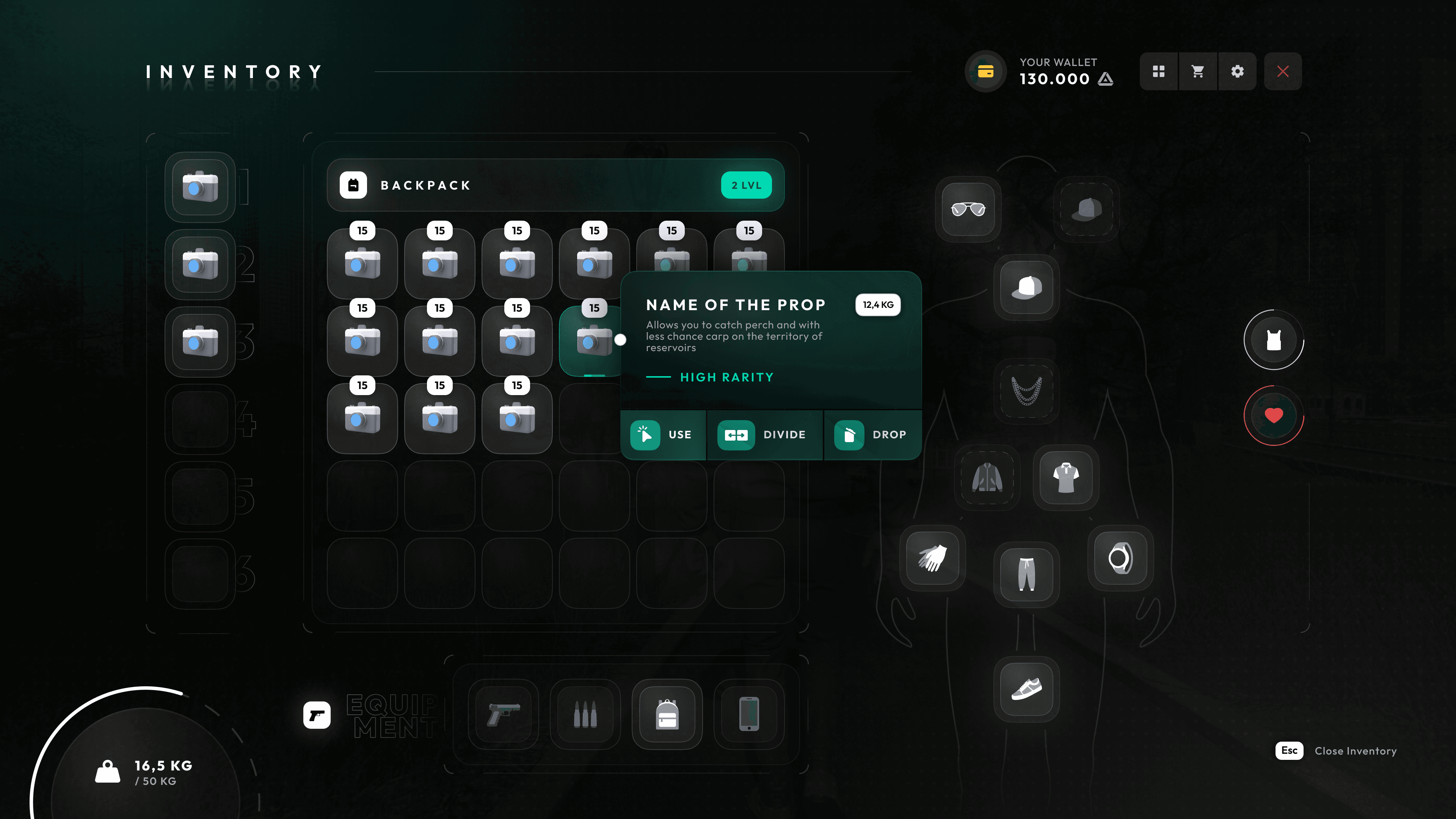
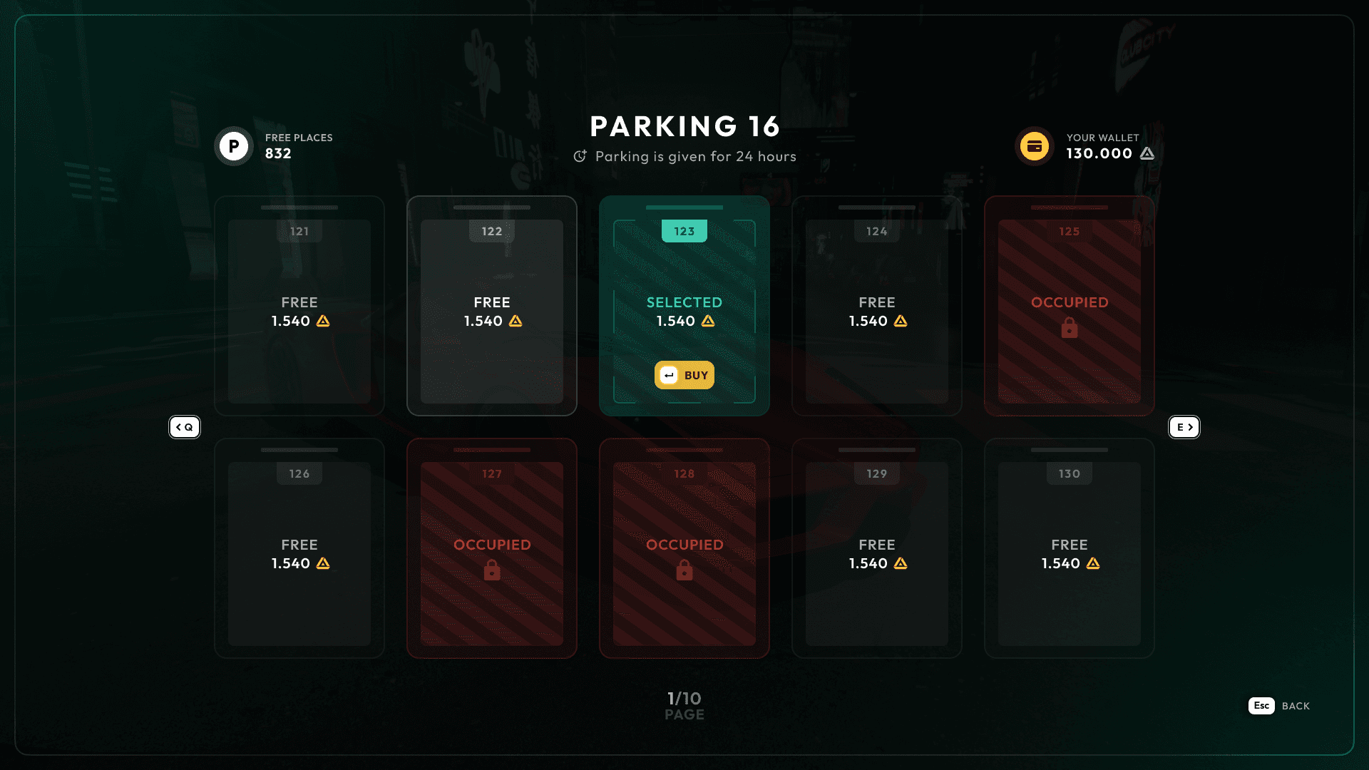
Design System
The design system for PCO is built on a clean, modern foundation with strong contrast, intuitive hierarchy, and a slight gamified edge.
The core of the visual identity revolves around three primary colors:
– A vibrant brand teal for primary actions and states
– A bold red for warnings and blocked elements
– A bright yellow for informational highlights and currency
Supporting shades like grayscale tones and white help maintain clarity and balance across different UI components.
Typography is set in Outfit, a geometric sans-serif typeface that brings clarity, structure, and a sleek futuristic feel across all screens — from bold headings to subtle labels and system messages.
Buttons follow a clear visual logic based on color-coded actions: green for confirm, gray for neutral, and red for destructive.
This system allowed for scalable design across dozens of in-game apps, keeping the experience visually cohesive and user-friendly.

Interface Showcase
Due to optimization reasons, video-showcase is only available from Desktop devices
Interface Showcase
Due to optimization reasons, video-showcase is only available from Desktop devices
Interface Showcase
Due to optimization reasons, video-showcase is only available from Desktop devices
Projects