About project
Wardex2025
Home security that stays quiet in black and silver, and turns red when it counts.
Wardex is a home security device the size of a finger: it sticks to a door or a window, senses it opening, sounds its own speaker and alerts the owner's phone. In the app the owner adds devices, sees each one's status, battery and connection, shares access with other people and turns the alarm on and off. In a small team building the device, its backend and the app, I designed the brand, from the logo and the app icon to a brand and UI guide, the app, from the splash screen to the alarm, and the web control center for the people who look after devices across several sites at once.
- Role
- Brand & UI designer in the Wardex team
- Client
- Wardex · home security device and app
- Platform
- Mobile · Web
- Tools
- Figma
Challenges
Wardex is a small device that guards a home, and its app is where the owner looks after it. Most of the time there is nothing to report: doors stay closed, batteries run down slowly, people come and go. When something does happen, the same screens have to say so at once. Before any of that, each device has to be paired from the phone and named, and the people who share it need their own access. The app had to stay calm while everything is fine, and make an alarm impossible to miss.
- iPhone screens, in one dark theme
- Devices in several places: home, office, garage or warehouse
- Shared devices: several people each, one of them the owner
- Pairing from the phone, over NFC or a QR code, then onto Wi-Fi
- Battery powered devices, on Wi-Fi or a direct connection
- The owner
- wants to see at a glance that every device is fine, and which one is not.
- The household
- shares the same devices, so every unlock and every disabled alarm should say who did it.
- A new device
- has to be paired, put on Wi-Fi and named before it can report anything.
Solutions
- 01
Black and silver, with colour for states
The interface is black, white and silver: white text at a few strengths, dark cards, and silver main buttons that share the logo's finish. Colour appears when it says something about a device: green for a device that is on and for setting one up, blue for everyday events, yellow for a battery running low, and red for an alarm.
Trade-offRed also marks destructive actions, like Delete Device. The two are told apart by weight: an alarm tints a card or the whole screen, a destructive action is red text only.
- 02
An alarm takes the whole screen
An alarmed device changes more than its badge. Its card on Home turns red with a red glow behind the header, and its own page glows red from the top, with the status set to ALARM.
Trade-offThe glow says that something is wrong, not which device it is: on a list of several, the red card and its badge still have to point to the one.
- 03
One slot, opposite actions
On the device page the first action is Trigger Alarm, a filled red button. In the alarm state the same slot holds Turn Off Alarm as a red outline, while Share Access and Disable Device stay put, so the way out of an alarm is where the way in was.
Trade-offA button that changes meaning in place relies on its label and on the screen around it: the red tint is what tells the owner which of the two states they are looking at.
- 04
Three short steps to add a device
Pairing is split into three screens under a progress bar: connect over NFC or a QR code, join Wi-Fi, then name the device and give it a place and a colour tag.
Trade-offThree screens take longer than one form, and naming comes last, when the device is already connected. It is the step that makes Front Door and Garage Gate readable on Home, so it stays, with only the room name optional.
Brand
An X that sits inside a shield
The wordmark sets WARDE in Inter Bold and gives the X its own inline face, wrapped in a shield outline that opens where the letter passes through. Letters and shield share one silver finish, white shading into grey. The app icon drops the letters and keeps the shield, drawn as an outline around a solid inner shield. The file holds four versions of the icon; on the black square the X sits behind the shield as bands of light, and the splash screen stretches that X across the whole phone.
Brand
- Silver light#FFFFFFTop of the logo's silver, and the main buttons
- Silver dark#999999Bottom of the logo's silver
- Black#000000Every screen and the icon's ground
- Purple#AD46FFThe welcome screen's glow and the purple icon
States
- Green#00BC7DSetting up: the progress bar, Scan QR Code, the chosen network
- Light green#00D492A device that is on or idle
- Red#FB2C36An alarm and a flat battery
- Light red#FF6467Alarm labels, the alarm glow and Delete Device
- Blue#51A2FFEveryday events, a direct connection and the owner badge
- Yellow#FDC700A battery running low
- Wordmark and app
- InterWARDE in Bold, and every title, label and line of text in the app
- The X
- Nordique Pro InlineThe X of the wordmark, and the bands of light on the icon and the splash
Sign in
A splash, a welcome and two short forms
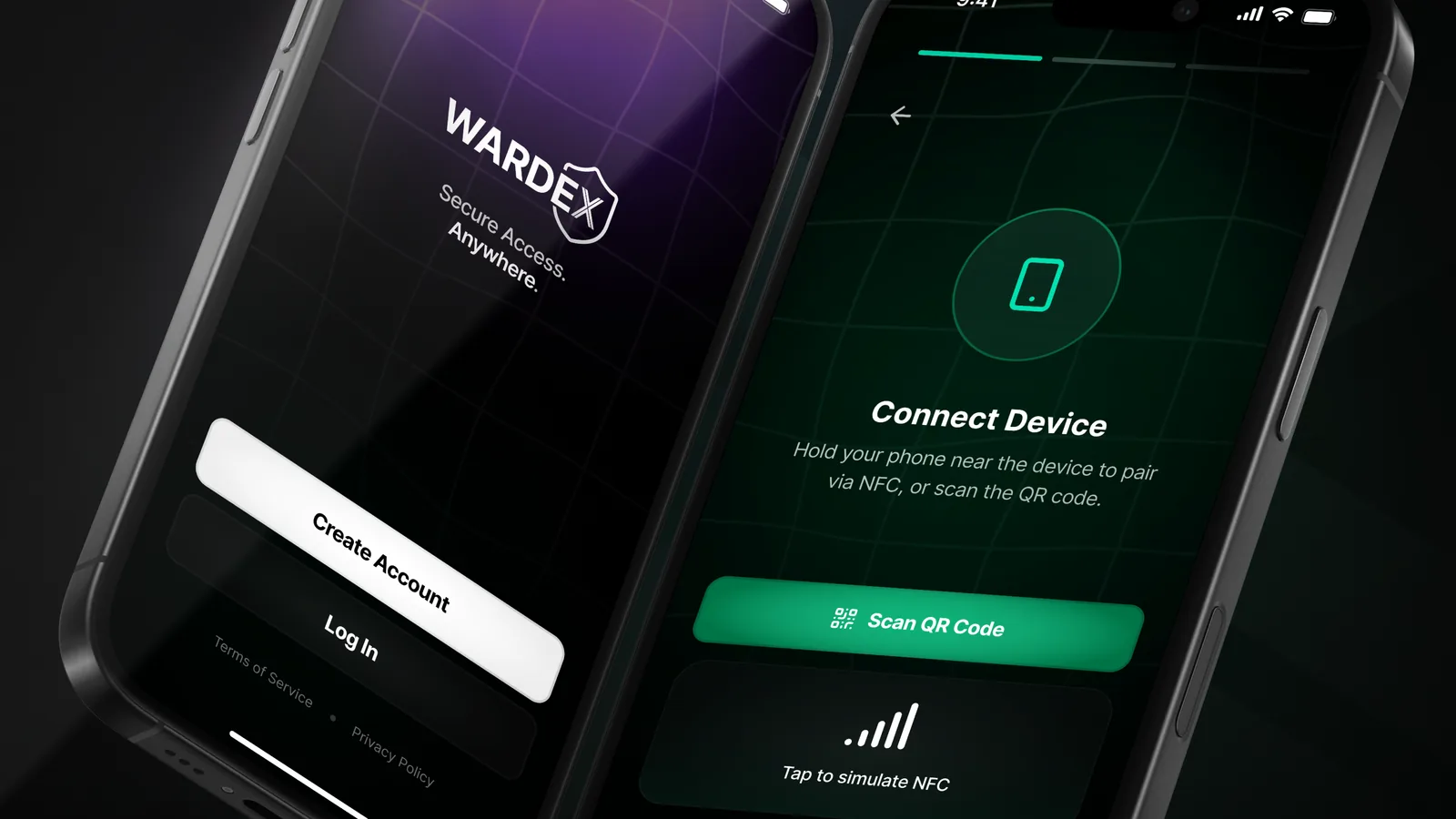
The app opens on the splash, the icon's shield over the big X. The welcome screen pairs the wordmark with a two-line promise of secure access anywhere and two buttons: Create Account in silver, Log In in dark. Sign-up asks for an email, a password twice and agreement to the terms; log-in asks for an email and a password, with Forgot my password under the fields. The fields carry their own states, down to an error in red.
The way in
Adding a device
Pair, join Wi-Fi, give it a name
A new device is added in three screens under a three-part progress bar. The phone pairs with the device over NFC or a QR code, the device joins a Wi-Fi network picked from a list, and then it gets a name, a location type (home, office, garage, warehouse or other), an optional room and a colour tag. The setup screens glow green, the colour the app gives to setting up.
Devices
Every device, and who did what
Home lists the devices as cards that answer the same questions in the same places: the name, the place and how many people use it, a status badge (idle, offline or alarm), the battery, the connection, Wi-Fi or direct, and when the device last reported. The battery takes colour by level, and a firmware update waits in a card under the list. Activity logs each day's events with who caused them, a person or the system, and a device's Users tab shows who shares it and who owns it.
Alarm
When a device goes off, the whole screen changes
An alarm is drawn as a state of the whole screen, not as one more badge. On Home the alarmed device's card turns red, and a red glow, kept for alarms only, rises behind the header. On the device page the top of the screen glows red, the status changes from ON to ALARM, and Trigger Alarm, a filled red button, becomes Turn Off Alarm, a red outline in the same place, while Share Access and Disable Device stay where they were.
Control center
The same system, on a screen that holds everything at once
The phone is for one person with a few devices in one place. The web control center is for whoever looks after many of them across several sites, and that is a different job: not one device at a time, but all of them in one table, with the one that needs attention found in a glance. The system does not change, only the density. Black and silver, green for healthy, red for an alarm, and the sidebar keeps a link back to the phone app.
- The overview answers four questions before anything is clicked: how many devices, how many online, how many alarms, whose battery is going
- Every list is a real table with filters: devices by state, logs by type, users by role
- Sites carry their own status, so a place with an alarm is visible without opening it
Five more screens of the panel
Results
Wardex has a brand and a finished set of app screens in one dark system, from the splash and sign-in to adding a device, the device list and the alarm.