About project
UltaHost2026
A desktop control panel that had to fit in two hands.
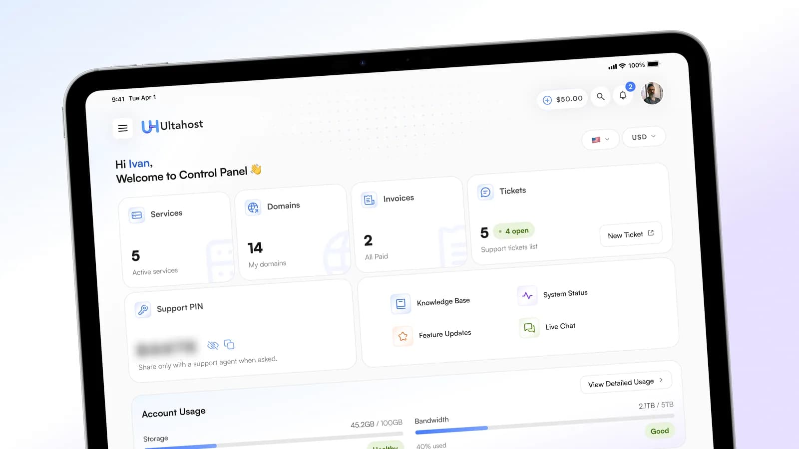
UltaHost is a hosting provider, and its control panel is where customers keep their services, domains, invoices and support tickets. The panel was built for the desktop. I redesigned it for the tablet in both orientations, built the component system the screens run on, and tested the prototype on a real iPad.
- Role
- Product & UI Designer, solo
- Client
- UltaHost · hosting control panel
- Platform
- Web · SaaS
- Tools
- Figma
Challenges
The panel was built for the desktop, and the screens that matter most show it: dense, multi-column tables. On an 11-inch iPad in portrait there is no room to keep those columns AND give every action a touch-sized target. The two usual escapes both charge the user for it: horizontal scroll hides half of every record behind a gesture, and dropping columns hides data while deciding on the customer's behalf which parts of their own invoice matter. The real problem was not the layout. It was the primitive.
- 834 points of width in portrait, with every action touch-sized
- A tablet is neither a phone nor a desktop: landscape sits close enough to a desktop layout to hide the problem, so portrait is the honest form and the harder one
- The brand is mid-modernisation, with blue-violet gradients used with intent, on a screen that is mostly data
- Two orientations, and neither may read as a stretched copy of the other
- The customer
- reads an invoice to answer one question: how much, by when, paid or not. On a table squeezed into a tablet, that answer is behind a sideways swipe.
- The business
- gets paid when overdue invoices get paid, so the way from an alert to payment has to be the shortest path in the panel.
- The brand
- is mid-modernisation. Ignoring the gradients loses UltaHost; using them everywhere buries the data.
Solutions
- 01
Portrait as the primary lens, landscape as a full companion
I took the 11-inch iPad in portrait as the lens for the whole redesign. Landscape is the comfortable choice: it sits close enough to a desktop layout that most of the existing panel survives, and that is exactly why I did not start there. Portrait is where a tablet stops being a small desktop and the interface has to be decided again. Landscape then got its own pass: a wider grid that genuinely fits more in a row, so the interface reflows for the orientation instead of scaling up.
Trade-offTwo complete layouts cost close to twice the drawing time of one plus a stretched variant. In exchange neither orientation reads as an afterthought, and the harder one set the rules.
- 02
Tables became cards, and no field was lost
This is the centre of the redesign. I looked at horizontal scroll and at hiding lower-priority columns; both push a decision onto the user, and both hide the fields a hosting customer actually reads: amount, date, status. So the primitive changed: each record became a card, with the same fields laid out for a narrow, touch-first column. The Invoices screen carries this in full.
Trade-offCards cost vertical space, and they give up the column-to-column comparison a table offers at a glance. For records you scan and act on one at a time, rather than columns you compare, that trade is worth it. On a screen built for comparison it would not have been.
- 03
Gradients as an accent, never as a surface
UltaHost's site is mid-modernisation: more room to breathe, and the brand's blue-violet gradients used deliberately rather than everywhere. I leaned into that: soft iridescent gradients on the icon tiles and a few key surfaces, everything around them kept flat. Light theme, matching the live product rather than redesigning the brand on the way past.
Trade-offGradient on every surface would read as more obviously branded and would turn a data screen into noise. Flat everywhere would be safe and anonymous. The accent-only rule keeps the brand present and the data first.
- 04
The file is driven by the system, not by typed-in values
Fonts, colours and spacing came from the live site, with a few colours pushed further where the tablet needed more separation. All of it lives in Figma as variables, text styles and effect styles, and every screen is built from them. Components went where it mattered: cards, buttons, icon buttons, tags, inputs and a shared icon set, each with real variants, instance swaps and states. One flexible stat-card component covers every card on the dashboard, and the button set scales across type, size, shape and state.
Trade-offBuilding the system before the screens is slower to the first finished frame, and it looks like a detour while you are in it. It pays back the moment a colour or a state has to change everywhere at once, and it is what lets the file survive past these screens.
- 05
Prototype the money flow in depth
The prototype goes deep where customers deal with money: the Invoices page, and the Pay sheet reached from the overdue alert, plus press and state animations across the components. I tested it on a real iPad, not in a browser frame, because touch targets and reach only tell the truth under a finger.
Trade-offFewer screens are clickable. The ones that are behave like the real product, which is what testing on a device and a developer handover actually need.
Results
The redesigned panel reads as a tablet product in both orientations, and because every screen is built from variables and components, a colour or a state changes everywhere in one edit.