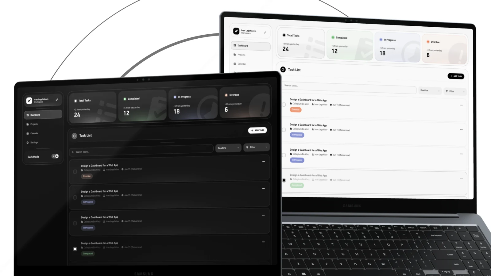
About project
Task dashboard2025
A dashboard that says what changed since yesterday.
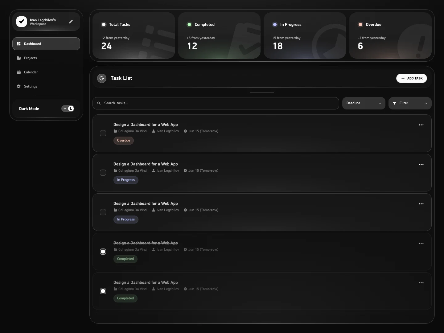
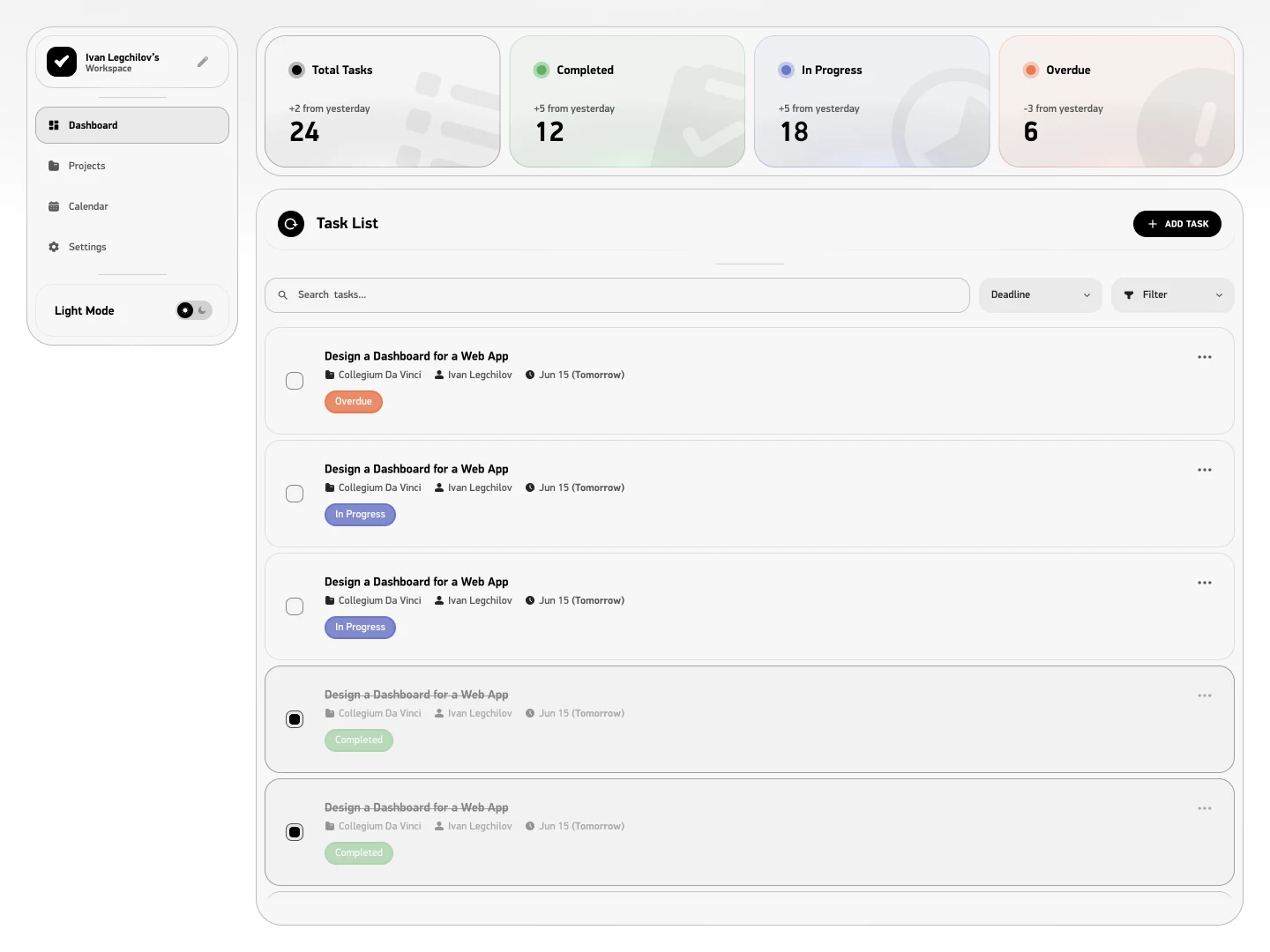
A desktop dashboard for a task management app, drawn at 1440 and built on auto layout: a sidebar that holds the whole product, four counters across the top and a task list underneath with search, sorting and filters. Both a dark and a light version, drawn as two designs rather than one inverted into the other.
- Role
- UI designer, solo
- Client
- Task management web app
- Platform
- Web · SaaS
- Tools
- Figma
Challenges
Most task dashboards open with a row of totals that tells the person nothing they did not already know, then a list that makes them read every row to find the one that matters. The screen had to answer two questions before anything is clicked: what moved since yesterday, and what is late.
- One desktop width, 1440, with a sidebar that holds the whole product
- A list row has to carry five things at once: title, project, person, deadline and state
- Two themes, and both of them have to look designed rather than inverted
- Built on auto layout, so the row survives a longer title and a longer project name
Solutions
- 01
Every counter carries a delta
Total, completed, in progress and overdue each show the change since yesterday under the label. The number is the state, the delta is the news, and overdue is the one card where a minus is good.
Trade-offA day over day delta means yesterday has to be stored and compared, which is a data requirement the design quietly creates.
- 02
State twice: as a chip and as weight
A task shows its state as a coloured chip and, when it is done, by dimming the whole row. The list can be scanned for what is unfinished without reading a single word.
Trade-offDimming makes completed work harder to read on purpose, which is wrong for anyone reviewing what was finished rather than what is left.
- 03
Dates in human words
A deadline is written as the date with the human name beside it, Jun 15 and Tomorrow, because the second one is what decides whether the task is opened now.
Trade-offRelative labels go stale: they are correct only if the screen recalculates them, and wrong in a screenshot the next morning.
- 04
Two themes, drawn twice
The light version is not the dark one inverted. The dark leans on glow and on large ghost glyphs behind the counters; the light replaces both with tinted cards and a soft shadow, because the same trick does not survive the swap.
Trade-offTwo drawings mean two things to maintain, and a component that changes in one has to be changed in the other by hand.
The screen
Numbers that carry a direction
A counter on its own is furniture: twenty four tasks tells nobody anything. Each of the four carries what it did since yesterday instead, so the row reads as movement rather than as a total, and the one number that should worry you, overdue, is the only one where going down is good. Under them the list does the actual work: search, sort by deadline, filter, and a row that fits a title, a project, a person, a date and a state without wrapping.
- Each counter shows its change since yesterday, with its own colour and a ghost glyph behind it
- Deadlines are written the way people say them: the date, and Tomorrow next to it
- A finished task dims instead of disappearing, so the list keeps its history without shouting about it
Results
One screen, finished in both themes and built so the rows hold up when the content grows.