About project
Uber redesign2025
A what-if nobody asked for: the ride flow in glass and near-black.
This one had no brief and no client. I was getting into glassmorphism and wanted a real product to try it on, so I took the flow I use most, ordering a car, and redrew it end to end: the home, planning a ride, setting the destination on the map and choosing the car. Most of the work went into the look, but the path picked up a few changes on the way, and the whole thing was wired into a prototype so it could be judged in motion rather than as four pictures.
- Role
- Personal project, solo
- Client
- Personal concept, not affiliated with Uber
- Platform
- Mobile
- Tools
- Figma
Challenges
Glassmorphism is easy to make pretty on a dribbble shot and hard to make work on a screen someone uses in a moving car, at night, with one hand. I wanted to find out where it holds up and where it falls apart, so I took a product with real constraints instead of inventing one. Nobody asked for this redesign, and that is the point: the only brief was my own.
- A flow people run without looking, so nothing may get slower for the sake of looking better
- Glass over a live map: the panel has to be readable and the route has to stay visible through it
- Near black everywhere, which means state has to be told with light rather than colour
- Whatever I drew had to survive being prototyped, not just exported as pictures
Solutions
- 01
Light instead of colour
The whole interface is near black, and the only things allowed to glow are the ones you are meant to touch: the primary button carries a coloured rim, the route is the brightest line on the map, and the active tab is lit rather than filled. Colour never means decoration here, it means attention.
Trade-offA palette this dark leaves no room for a second accent, so anything that also wants attention has to compete with the button or go without.
- 02
Objects instead of pictograms
Every category on the home screen is a rendered object rather than a flat glyph, so the grid is scanned by shape and material instead of by label.
Trade-offEight renders is a lot of art to keep consistent, and it is the part of this design that would cost the most to actually ship and maintain.
- 03
One button that changes its mind
Setting a destination on the map uses a single primary button whose label follows the state: Search Destination while the pin is loose, Confirm Destination once it is placed. The screen never grows a second button to say the same thing twice.
Trade-offOne target with two meanings only works while the map makes the state obvious. If the pin is ambiguous, so is the button.
- 04
The price inside the action
The amount is set in the confirm button rather than above it, so the number and the decision share one target and one glance.
Trade-offIt makes the button wide and text heavy, and it stops working the moment the price needs a breakdown next to it.
- 05
Judge it in motion
All four screens were wired into a prototype, including the loading state of the home screen, because a glass panel sliding over a map is a different thing from a glass panel in a static frame.
Trade-offPrototyping a personal project eats the time that would otherwise go into more screens. It is also the only reason the transitions are defensible.
Home
Show the thing, not an icon of the thing
The home screen carries a shop: rides, food, couriers, groceries, flowers, scooters. In the app those are flat pictograms, and they all look like the same product. Here every category is a small rendered object with its own light, so the eye sorts them by what they are before it reads a word. Everything else stays near black, which is what lets eight bright objects sit in one grid without turning into noise.
- Rides and Eats are two tabs at the top rather than two apps
- Recent addresses ride in a row above the grid, one tap from the search field
- The bottom bar floats as a glass pill instead of sitting on a solid ground
Destination
Three doors to the same answer
Naming a destination is where a ride app is won or lost, and the honest truth is that people arrive at it in different states: some know the address, some recognise it in a list, and some only know the place when they see it on a map. So the screen offers all three at once, on one card, instead of making the map a second screen you have to discover. Under them sit recent places with the distance to each, because distance is what people actually choose by.
- Type it, pick a recent, or drop a pin: three ways, one card
- Search in a different city and Saved places sit next to Set location on map, as equals
- One button carries the step and changes its own label rather than adding a second one
The ride
The price belongs inside the button
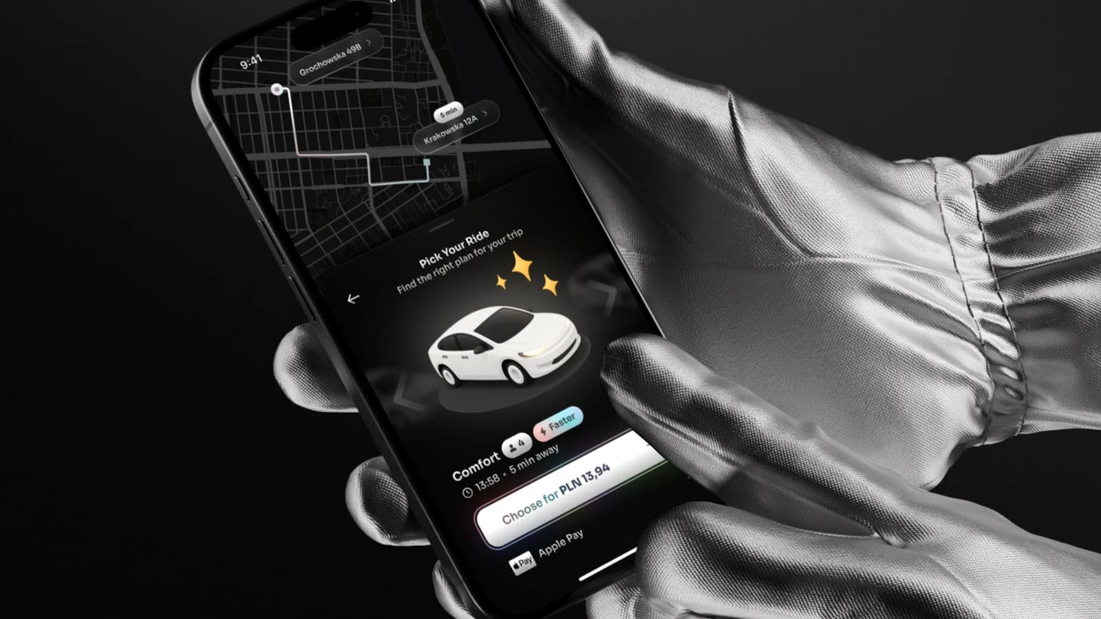
By the time the car is being chosen the map has done its job, so the sheet takes the bottom half and the route stays visible above it with both addresses and the time on it. The class is a rendered car rather than a line drawing, the two things worth comparing sit next to its name, and the price is set inside the confirm button: the amount and the action are the same target, so nobody has to check one against the other before tapping.
- Seats and Faster sit beside the class name, because those are the two questions asked
- The button says the price, so confirming and knowing the cost are one move
- Apple Pay sits under the button, not behind another screen
Results
A personal exercise that came out as a small finished thing: one flow, drawn end to end and wired up so it can be used rather than looked at.