About project
Summoning Card Game2026
A whole card phase on one screen, and the art still keeps the stage.
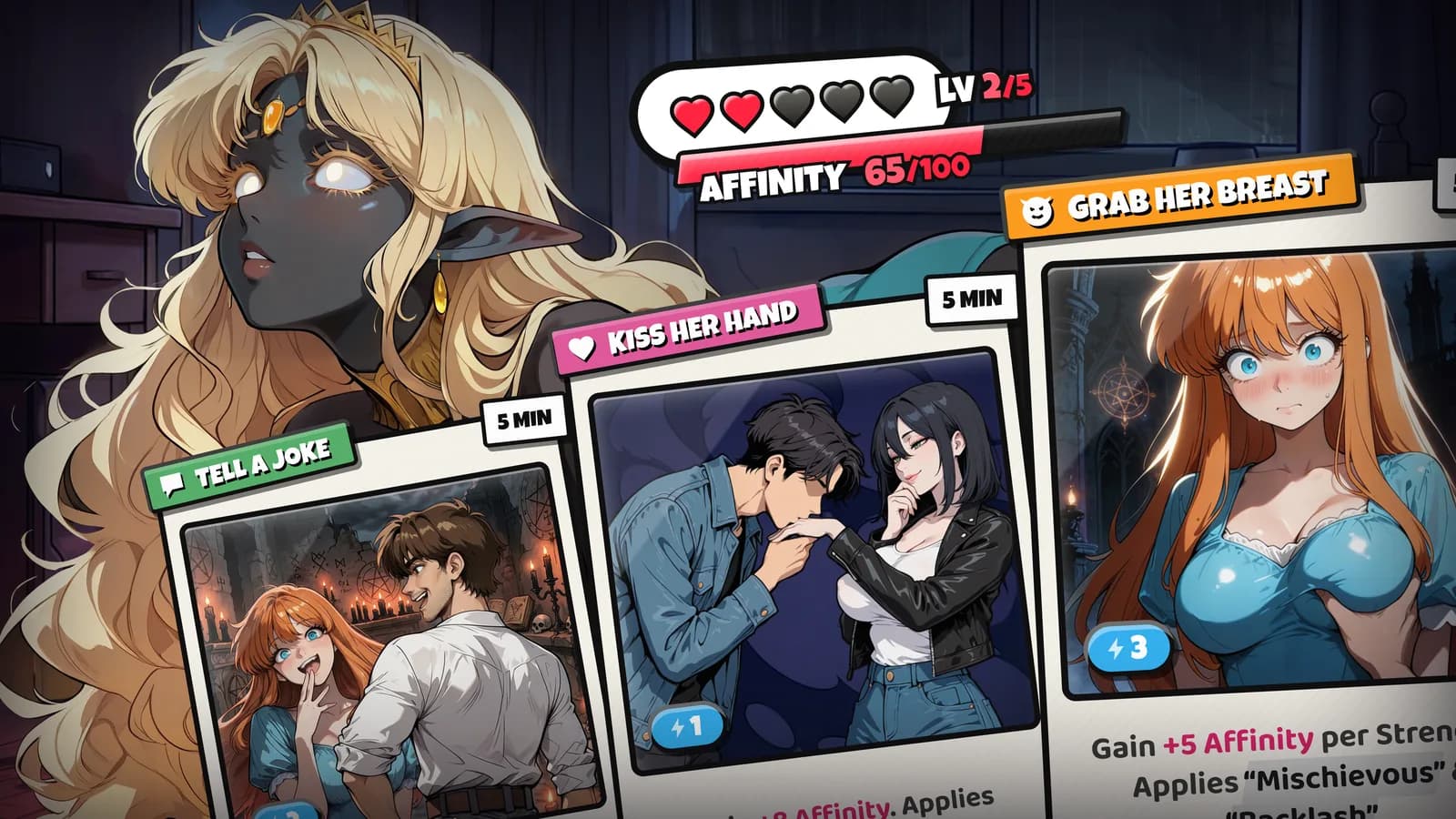
An adult card game for PC: every night the player summons an entity from a grimoire and courts her with cards across five levels of relationship. I designed the interface around the illustrations: the card-phase HUD, where the whole game is played, and the dialogue screens that carry the story, in a text box and a speech bubble version.
- Role
- UI/UX designer, solo
- Client
- Adult card game · PC
- Platform
- Game · PC · 18+
- Tools
- Figma
Challenges
The card phase is where the whole game happens, and one screen has to hold all of it at once: the summoned character with her name, affinity and relationship level, her passives, two resources to spend, a hand of four to six cards where some are still locked, the deck, the discard, a way to break the summon and the mana reward. Every card carries eight facts of its own. The real problem was keeping all of it readable while the art keeps the stage.
- A hand of four to six cards, some of them locked by relationship level
- 5 card categories and 5 rarities, readable without breaking the card
- Two resources that never refill during a summon: initiative and time
- A break summon action that must not look like the main call to action
- The player
- has to see at a glance which cards can be played, what they cost, and how far away the next relationship level is.
- The art
- fills the screen with a full-height character, so every panel laid on top of it competes with her.
- The summon
- can be broken off at any moment, so that action has to stay within reach without ever being mistaken for a card play.
Solutions
- 01
Three directions before one
Before settling I took the look through three directions: an occult gothic with its own colour and type system, a classic comic style that echoes the illustrations, and a sticker style. The sticker direction won: bold lettering and stuck-on panels read as playful rather than solemn, which fits a flirty summoner game better than a dark RPG, and they sit lightly on top of the art instead of framing it.
Trade-offCarrying three directions far enough to judge them took time that could have gone into polish. In return the choice was made between finished-looking options rather than between sketches.
- 02
Colour means a mechanic, never decoration
Every colour is tied to the game. Red and pink are her side: affinity and the hearts. Blue is you: initiative. Purple is magic: the mana reward. Gold is value: legendary cards, titles and the timer, because time is a resource too. Green is the deck, social cards and the uncommon tier. The player separates what is theirs from what is hers before reading a single number.
Trade-offA strict mapping leaves no colour free for decoration, and some colours do double duty, like green for the deck and for social cards. Consistent meaning was worth the tighter palette.
- 03
Double encoding on every card
Category is a coloured ribbon plus an icon, rarity is the colour of a small badge in the corner, and the card's shape and size never change, so the hand stays readable as one row. A locked card stays in the hand: the body darkens by half, a lock sits in the centre over a red NEEDS AFFINITY LV 4 band, and the effect text stays visible, so the player knows exactly what they are missing and why.
Trade-offRarity as a quiet badge is less spectacular than rarity frames, and a legendary card does not shout. It keeps six different cards scannable side by side.
- 04
The art leads, the HUD floats
The character takes the maximum of the screen, and the interface floats over her in the corners and along the bottom. A screen-wide vignette pulls the eye to the centre, and every line of white text carries a dark shadow so it reads over any art. Break Ritual sits away from the hand, red and clearly secondary, so it cannot be hit by accident on the way to a card.
Trade-offFloating UI over busy art needs shadows and a vignette everywhere, and that darkens the edges of the illustration. Contained panels would be cleaner and would hide more of her.
- 05
Dialogues with as little chrome as possible
The text box screen keeps one dark panel at the bottom with an orange name badge, key words in colour and a single NEXT. The speech bubble goes further and drops the panel: a dark bubble beside the character, her name above it and SKIP in the corner. The name badge is orange on both, so the speaker always reads the same way.
Trade-offThe bubble shows more of the art and holds less text: a long line either shrinks or runs over her. Two versions were drawn rather than one, so a scene can take the fit it needs instead of the worse one everywhere.
Results
The whole card phase fits on one screen without shrinking the character: the interface holds the edges, and colour tells the player's side from hers before a number is read.