About project
Aetherlords2025
A steampunk HUD, laid out where MOBA players already look.
Aetherlords is a MOBA for PC set in a steampunk world. I designed the interface players spend the match in: the in-match HUD, and a collection screen where choosing a hero and changing their loadout happen in one place. The brass had to feel mechanical and hand-built without costing anyone a fraction of a second in a fight.
- Role
- UI/UX designer, solo
- Client
- Aetherlords · PC MOBA
- Platform
- Game · PC
- Tools
- Figma
Challenges
MOBA players arrive trained by Dota 2 and League of Legends: they know where the minimap, the abilities and the items live, and they read them in fractions of a second. Aetherlords needed that familiarity and, at the same time, a steampunk world with an identity of its own, down to the frame around every number. Ornament is the natural enemy of a HUD, so the real question was where the brass is allowed to go.
- Read mid-fight, in fractions of a second, over a busy battlefield
- Positions players already know from Dota 2 and League of Legends
- A steampunk skin of brass, pipes and gears that must never cover a number
- Two teams told apart at a glance, on the scoreboard and on the map
- The player
- reads the HUD mid-fight. Health, cooldowns, mana, gold and the map have to be found without looking for them.
- The style
- brings brass frames, pipes, gears and smoke, and every one of them competes with the numbers for attention.
- The roster
- already runs to dozens of heroes across three roles, each with a loadout, so picking a hero and dressing them cannot turn into a trip between screens.
Solutions
- 01
Familiar positions, held by one console
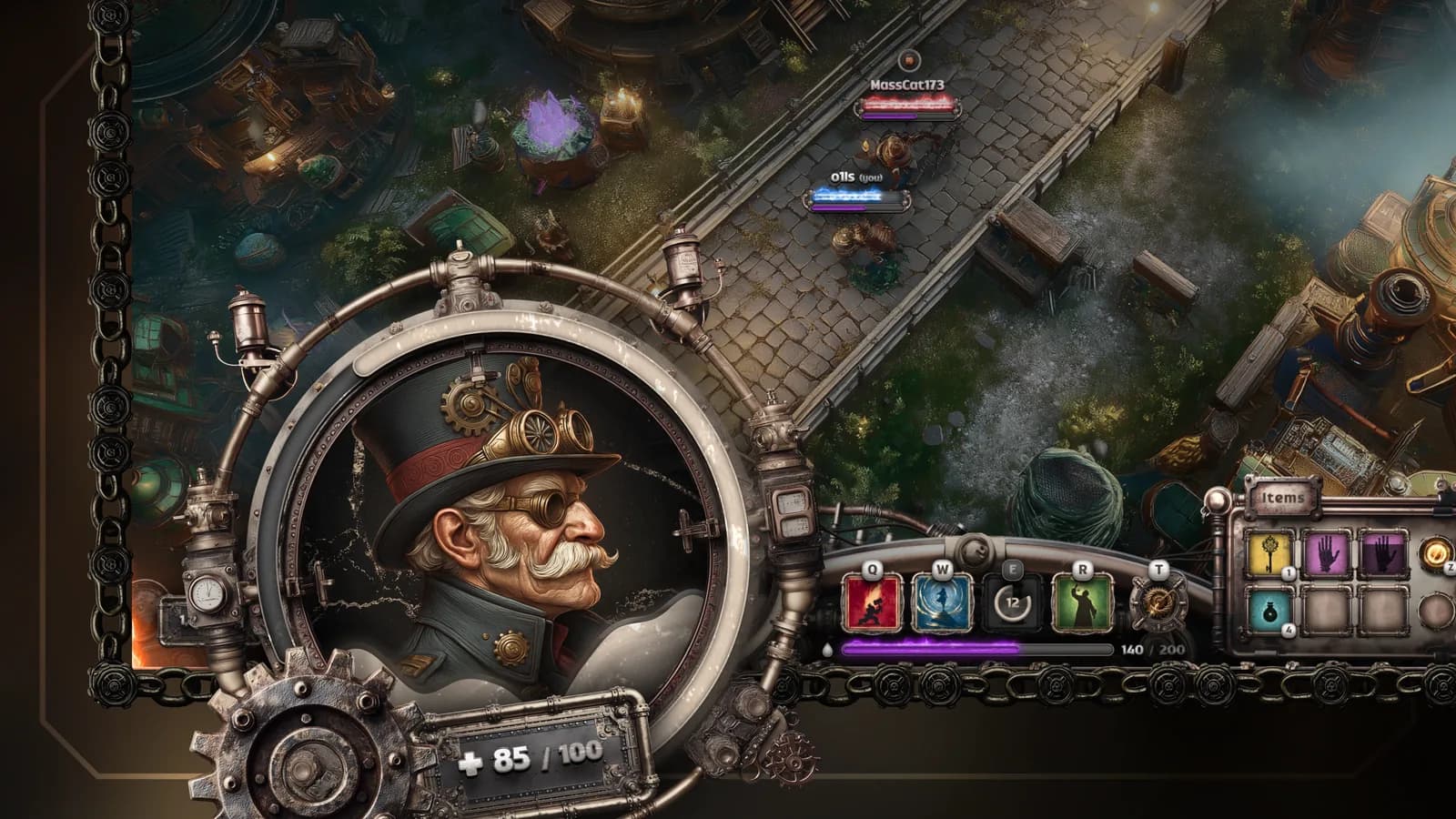
I kept the positions players already know from Dota 2 and League of Legends and changed what holds them. The round portrait with health as a ring around it, the skill row with its mana bar, the item slots and the minimap sit in one brass console joined by pipes along the bottom edge, instead of separate panels. The scoreboard with both teams' portraits runs along the top, the menu and the performance stats take the top left corner, and the gold with the shop key sits bottom left.
Trade-offJoining the modules makes the console one large object, heavier than the floating panels of League. In return the eye travels along a single strip for everything it checks in a fight, and the steampunk look becomes the structure itself rather than decoration laid on top.
- 02
Hero select and loadout on one screen
Inventory and character selection became one collection screen, built on two adjacent Dota 2 layouts: the hero loadout and the hero grid. The hero stands on the left, the loadout with its slots and the item tooltip fill the middle, and the hero list with role tabs sits on the right, with PLAY in the corner. Changing a hero and changing what they wear no longer means leaving one screen for another.
Trade-offOne screen carries more at once and gives each part less room than two dedicated screens would. In exchange the chosen hero stays in sight while the loadout changes.
- 03
Brass on the frames, clean type inside them
The steampunk lives in the materials: brass frames, pipes, gears, smoke and label plates. What sits inside the frames stays flat and readable. The palette is a dark neutral base, one hot accent (#FF7439) and a red and a blue for the two teams. Two typefaces split the work: Caliya for headings, labels and numbers, Gilroy for everything you read.
Trade-offKeeping ornament off the content makes the screens plainer than steampunk key art usually is. A number read in fractions of a second has no room for brass texture.
- 04
Components only where they earn their place
Instead of turning every element into a component, I built them only where they helped me design faster and stay consistent: the square and round item slots, and the inventory slot, which went through a second version that makes room for an icon before the value and lightens the text shadow. The rest stays as placed art, without a library of near-duplicates.
Trade-offHanding over to development will need more of the system formalised. Until the screens settled, that time was better spent on the screens themselves.
- 05
Real content, written for the world
The screens carry a world rather than dummy text: Selwyn Steamrattle, a Warden and Steam Operative, Veteran of the Aether War; Steamwright's Resolve, an event-exclusive rare coat worn by battlefield engineers and enforcers; the hero roles Vanguard, Operative and Arcanist with their counts; and a match in progress at 35:56. Real lengths test a layout the way dummy text never does. The label plates were generated in Midjourney; the interface itself was built in Figma.
Trade-offWriting content takes time that could have gone into more screens. It is also the fastest way to learn whether a name, a stat line or a description actually fits.
Results
The HUD keeps every position a MOBA player expects, and the brass stays on the frames, never over a number.