About project
Ball Sort Game2026
Every control a casual puzzle needs, and the board still wins the screen.
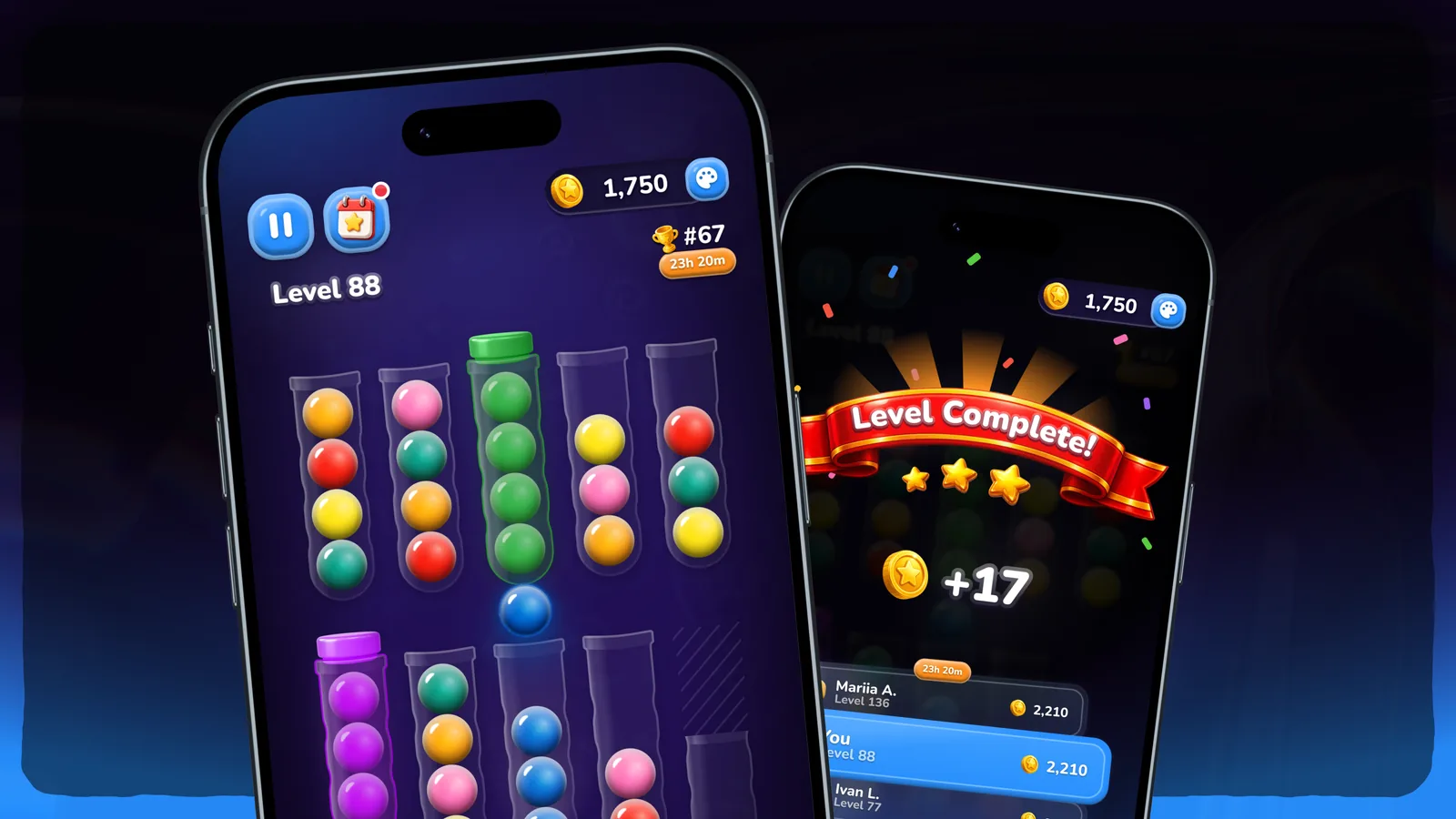
Ball Sort is a casual puzzle for players aged 35 to 50: tap a flask and its top ball lifts, drop it on a matching colour, and four of a kind close with a stopper. I designed the game screen and the win screen, drew every flask and ball from scratch, made yarn and wooden ball materials for Unity, and put it all together as a prototype you can play right here.
- Role
- UI/UX designer & game artist, solo
- Client
- Ball Sort · casual puzzle for mobile
- Platform
- Game · Mobile
- Tools
- Figma, Unity
Challenges
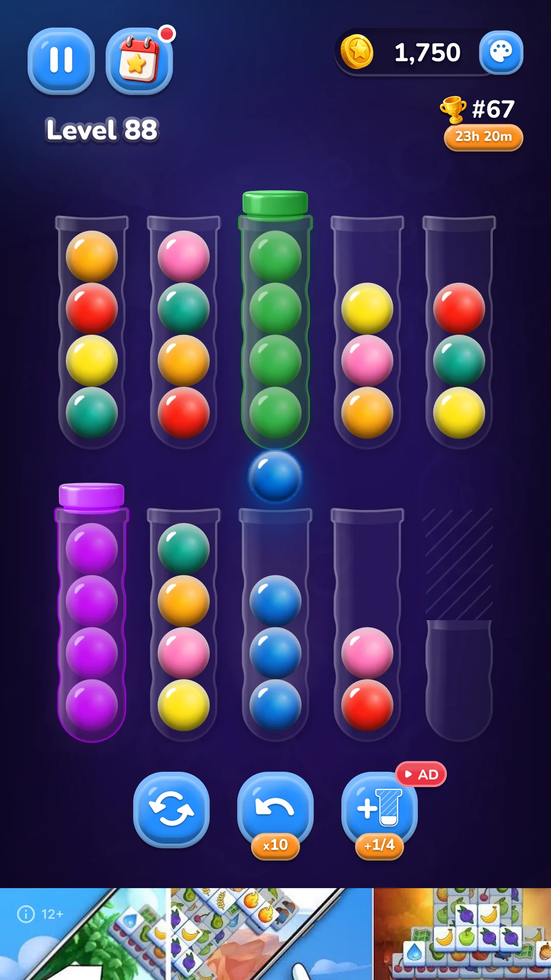
The main screen has a lot to carry: the level number, menu, store, rating, daily mode, restart, ten steps back, an extra flask for watching an ad, the balls, the flasks, the background and an ad banner that always owns the bottom. Put twelve elements of equal weight on a phone and you get a control panel, not a game. The real problem was hierarchy: the board has to win the screen, and everything else waits its turn.
- 12 elements on one screen, and none can go: each is gameplay, progress or revenue
- Up to 12 colours on balls about 34 px across
- Free space above the flasks for the lifted ball, and an ad banner always at the bottom
- A calm, grown-up palette rather than neon, for an audience of 35 to 50
- The player
- is 35 to 50, about half of them women. Targets have to be generous, contrast high, and twelve ball colours must stay apart at a glance, not only side by side.
- The board
- needs free air above the flasks, because the top ball lifts on every tap, and it loses the bottom strip to the banner for good.
- The business
- sits in four of the twelve: the store, rating, daily mode and the flask for an ad. None of them can hide, and none of them may drown the board.
Solutions
- 01
Three bands, placed by habit rather than novelty
I split the screen by function into three bands: the stats, the board, and the controls with the banner under them. Placement follows the genre on purpose, balance top right and pause top left, because people already know where to look. Every button is large, and the ones that drive the level are deliberately a size up from the rest. The empty middle of the top bar is left for the camera island on newer phones, and the layout still holds on older ones.
Trade-offPlacing by convention gives up the chance to surprise. For this audience recognition is worth more: nobody should have to hunt for pause in a casual puzzle.
- 02
Two icon families, on purpose
The icons look inconsistent, and that is the point. They split into two groups by meaning: control of the current level (pause, restart, undo, the extra flask) and the metagame (balance, rating, dailies). The player tells, without learning it, what changes this level and what changes overall progress. The palette button is the one exception: it stays flat, so a bar that already carries the 3D coin does not overload.
Trade-offOne icon style would look tidier on a style sheet. Two cost that uniformity, and in return the style itself carries a message the player reads for free.
- 03
Every flask state drawn as a component
Flasks and balls for every state, empty, filled and open by a quarter or more, are drawn from scratch in Figma and built as components in twelve colours. The lifted ball loops between a rest and a lift pose, and the extra flask unlocks for an ad in quarters, from 1/4 to full, on a fixed 44 by 171 footprint with a ghost outline of the full flask. The one piece not drawn by hand is the stopper: generated in ChatGPT, then adapted to each colour manually.
Trade-offDrawing flasks from scratch was slower than dressing a stock asset. It is also the object the player touches on every move, and a component with real states is what a developer takes over without redrawing anything.
- 04
Readability measured at game size, not at showcase size
The yarn and wood textures looked right at 216 px and turned into a blob at the real 34 px. I tuned the base renders in Figma (contrast, highlights) and the colour blend, then checked the distance between all 66 colour pairs at game size. Before the fix the closest pair, brown and orange, sat at 5.3: at 34 px one and the same ball. After it the minimum is 13.98 for yarn and 14.53 for wood, and no hex code changed, so textured and plain balls share one palette. The pipeline was built with Claude on my approach: the colouring method, the 34 px check and the choice of skins were mine; Claude assembled the maps, checked the numbers and packed the export for Unity.
Trade-offContrast came from lightness rather than new colours, so the palette stays one system. The price: one pair for yarn and two for wood still sit just under the comfortable threshold of 15.
- 05
A win screen that only leads forward
The key decision is colour: the game lives on purple, so the win takes a blue accent, because players see this screen after every level and it has to feel different at once. The top is deliberately darker, with the red ribbon, the stars and the confetti as the accent. Only what matters stays: the coins earned, the rating and the way on. The rating cards are scattered slightly to show places changing, and the glass on the neighbours points back to the flasks.
Trade-offNo menu and no restart means one more tap for a player who wants to leave. That is the intent: the screen keeps the player in the loop instead of showing the exit.
Results
The screens, every flask state and both materials come together in a playable prototype, so the game is judged in play rather than as separate sheets.